| Image |
Comment |
| 07/07/2006 09:20:59 AM |
Handwrittenby betsypdxComment: Your use of stationery is secondary in the composition of this image. This could hurt you in the scoring. I would have liked to have seen this with a different background color to better emphasis the paper. Overall, a very well done image. |
 Photographer found comment helpful. Photographer found comment helpful. |
| 07/07/2006 09:20:53 AM |
Writing Upon Fleshby otisXmikeComment: I assume this is a work in progress, as there is very little color with work done on the back. I like the lighting and the background but her upper hip breaks the contour of the body. Perhaps if her legs were straightened some it would help continue the flow. |
| Photographer found comment helpful. |
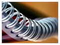
| 07/07/2006 09:20:48 AM |
spiral slideby RikkiComment: Great angle and lighting. This would have really popped if shot with a black background. |
| Photographer found comment helpful. |
| 07/07/2006 09:20:41 AM |
Focusedby JPetraliaXComment: The word are the primary focus of this compostion and will probably cause several voters to ding you for it. The image is technically sound and well done. |
| 07/07/2006 09:19:58 AM |
Paper airplaneby pinbokeshattaComment: I like the overall composition of this image. I'm not quite sure what that is next to the airplane on the left. An apple stem? This distracts from the main focus of the composition. |
| Photographer found comment helpful. |
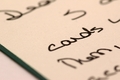
| 07/07/2006 09:19:53 AM |
From the desk of...by dockieComment: The blues in this image are very pleasing but I would have liked to have seen the paper a little whiter. Nicely done overall but it doesn't have that "I wish I had taken that image" appeal to it. |
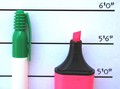
| 07/07/2006 09:19:47 AM |
He Tried To Put A Lid On Itby Tap10Comment: Interesting concept. The lighting on this photo leaves it a little flat looking. If you could have moved the markers away from the background some it would produce better defined shadows and help give the photo more depth. Another method would be to move the light to the right hand side of the pink marker instead of primarily straight on. |
| Photographer found comment helpful. |
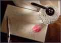
| 07/07/2006 09:19:44 AM |
The Answerby scarbrdComment: Nice effect of the lighting through the pen holder. I would like to see the out of focus portion of the pen holder in a different position, as my eye is drawn to it after reading the message. |
| Photographer found comment helpful. |
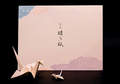
| 07/07/2006 09:19:36 AM |
Tsuruby pidgeComment: Nice arrangement. I would like to have seen the colors in the cranes a bit more saturated. |
| Photographer found comment helpful. |
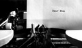
| 07/07/2006 09:19:29 AM |
Dear Momby vprndsgComment: The B&W conversion is very effective and well executed. I wonder how this would look with a little more noise to similute film grain. |
| Photographer found comment helpful. |
Home -
Challenges -
Community -
League -
Photos -
Cameras -
Lenses -
Learn -
Help -
Terms of Use -
Privacy -
Top ^
DPChallenge, and website content and design, Copyright © 2001-2025 Challenging Technologies, LLC.
All digital photo copyrights belong to the photographers and may not be used without permission.
Current Server Time: 08/20/2025 11:57:24 PM EDT.