| Image |
Comment |
| 07/07/2006 09:22:31 AM |
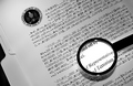
Deciphering the Codeby SchuffComment: The connection to the challenge is weak. The execution of the concept is good. I don't think this will win a ribbon but it is a very nice image. |
 Photographer found comment helpful. Photographer found comment helpful. |
| 07/07/2006 09:22:19 AM |
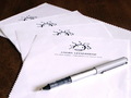
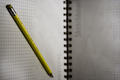
Letterhead Stationeryby lauralinkComment: Nice layout and contrast. I would like to see the overall focus of the image shifted to the front with the pen and first piece of paper equally in focus. |
| Photographer found comment helpful. |
| 07/07/2006 09:22:04 AM |
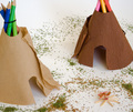
Indians of the Great (paper) Plainby PeterPicComment: Very creative and a lot of effort was put into this shot. This is very suitable for stock photography. I think it is cropped a little too tightly, as I would like to see the tips of the pencils on the right side of the image. |
| Photographer found comment helpful. |
| 07/07/2006 09:21:56 AM |
blank paperby shaundpComment: Nice lines and cropping. A little fill light in the top right corner to eliminate the shadow from the rolled paper would have really made this image work. |
| Photographer found comment helpful. |
| 07/07/2006 09:21:51 AM |
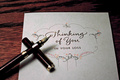
The Dreaded Letterby jusdino4itComment: I would have liked to see the tip of the pen in focus with the paper. The composition is well thought out and overall, this is a very nice image. |
| Photographer found comment helpful. |
| 07/07/2006 09:21:34 AM |
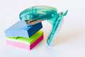
Attack of the Staplerby zoshyiiComment: A fun image to look at and well thought out. The lighting is a bit harsh, which causes the paper to look a little washed out. |
| 07/07/2006 09:21:30 AM |
The Daily Stationeryby helloiloveyouuComment: Not what I would typically think of as stationery but you do write on it. I really don't have any suggestions for improvement excpet for removing the small area at the upper right hand corner which isn't part of the crossword puzzle and not part of the black background. Maybe a little more contrast or converting this to B&W would make it pop more. |
| Photographer found comment helpful. |
| 07/07/2006 09:21:25 AM |
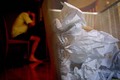
Writers Blockby fullmetalfinnComment: The image definitely communicates the intent of the title. The doorframe behind the wastebasket is a little distracting and the colors in the background keep drawing my eye away from the wastebasket. That isn't entirely bad, as the writer is as important as the failed attempts. |
| Photographer found comment helpful. |
| 07/07/2006 09:21:19 AM |
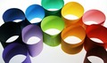
paper rainbowby margiemuComment: Not quite a rainbow, as the colors are random instead of continous. The green paper in the center should have been rotated so the tape doesn't become the center point of the image or better yet, so it doesn't show at all.
Edit for Typo's Message edited by author 2006-07-13 13:10:01. |
| Photographer found comment helpful. |
| 07/07/2006 09:21:14 AM |
no idea ?by gocComment: Interesting rotation of the image. It could use a little bit more saturation to make the yellow pencil pop more. |
| Photographer found comment helpful. |
Home -
Challenges -
Community -
League -
Photos -
Cameras -
Lenses -
Learn -
Help -
Terms of Use -
Privacy -
Top ^
DPChallenge, and website content and design, Copyright © 2001-2025 Challenging Technologies, LLC.
All digital photo copyrights belong to the photographers and may not be used without permission.
Current Server Time: 08/20/2025 11:57:23 PM EDT.