| Image |
Comment |
| 03/15/2009 01:15:54 PM |
Sphereby IreneMComment: Back to comment: A mountain range inside a glass globe. An island emerging from the sea. Whatever it is, it is worth bumping to a 10. |
 Photographer found comment helpful. Photographer found comment helpful. |
| 03/14/2009 04:23:29 PM |
I Quitby Poecia773Comment: Back to comment: The lighting is nicely done but the crop is a little tight, making it hard to understand the context of the image. |
| Photographer found comment helpful. |
| 03/14/2009 04:16:36 PM |
Brand New !!by KaizerComment: Back to comment and bump: I gave the other birth image a 10 and yours is worthy as well. 10 |
| Photographer found comment helpful. |
| 03/14/2009 04:16:00 PM |
You Gonna Finish That?by w4jzzComment: Back to comment: The colors of the cardinal are really nicely done. The image could use a bit of sharpening. I�m not sure how experienced you are with downsizing images but most images get softer and require sharpening after they are downsized to DPC size. |
| Photographer found comment helpful. |
| 03/14/2009 04:12:21 PM |
apples and dandelionsby timfythetooComment: Back to comment and bump: I'm not a real fan of the high key look here but I've looked at this image at least 4 times. Something keeps drawing me back (it couldn't be that look of pure joy could it) and this image is definitely starting to grow on me. 7 |
| Photographer found comment helpful. |
| 03/14/2009 04:02:43 PM |
MY DOMAINby Gordon_1Comment: Back to comment: You captured a very lovely pose; however, the post processing doesn't look very natural to me. |
| Photographer found comment helpful. |
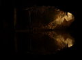
| 03/13/2009 05:48:54 PM |
Gate to Fairylandby KAOSComment: Back to comment: this image looked a lot darker on my laptop and it was hard to see any detail. Now that I see it on my home computer it has a lot more appeal. However, there is a bit more dark area on the left side than what is necessary to balance the image and if you would have posted this at 720 pixels as allowed, the detail on the right would have been much more dramatic. |
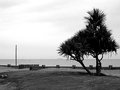
| 03/13/2009 05:45:57 PM |
Bleak Strandby oldgrouseComment: Back to comment: You did a nice job with the b&w conversion but the image lacks a strong focal point for me. |
| 03/13/2009 05:44:37 PM |
Monumentousby LonzComment: Back to comment: The exposure is spot on and the post processing is good. However, having the statue centered really makes the composition look static. |
| Photographer found comment helpful. |
| 03/13/2009 05:42:38 PM |
[ D E P T H ]by ericwooComment: Back to comment: A bit over processed for my taste. The brightness of the foreground takes away from the perception of depth. Or it could be that the contrast of the background isn't as wide as the foreground and therefore the background looks flat. |
| Photographer found comment helpful. |
Home -
Challenges -
Community -
League -
Photos -
Cameras -
Lenses -
Learn -
Help -
Terms of Use -
Privacy -
Top ^
DPChallenge, and website content and design, Copyright © 2001-2025 Challenging Technologies, LLC.
All digital photo copyrights belong to the photographers and may not be used without permission.
Current Server Time: 12/20/2025 02:44:40 AM EST.


![[ D E P T H ]](https://images.dpchallenge.com/images_challenge/1000-1999/1005/120/Copyrighted_Image_Reuse_Prohibited_772199.jpg)