|
|
|
Showing 431 - 440 of ~473 |
| Image |
Comment |
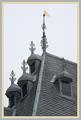
| 02/03/2003 07:43:23 AM | Craftsmanshipby AzrifelComment: Critique Club
The first thing that I noticed about this picture was the borders. They made me cringe violently for about 60 seconds. I must honestly say that I don't particularly like border to begin with, but well. if you HAVE to use borders, I would suggest using a very thin black or white border (1 pixel, perhaps?) around the picture before adding coloured borders.
When that whining is over width, I have to say I like your image. The crop on the left side leaves something to be desired, I feel, but overall the image is very good. Nice contrast, good sharpness and interesting composition. The thingies on the window overhangs are very dtailed, and they make me kind of lose focus: I would think that the intention would be to pull the attention to the "wimpeltje" (whatever that is called in English) on the spire.
I think, with the photo subject chosen, you could not have done a lot better. When that is said, I think I should probably say that I think you could have found more interesting subjects in that village.
Personally, I gave you a 5, because I couldn't quite make up my mind if I liked the image or not. strangely enough, I didn't know why then, and I don't really know why now. I'm sorry
Haje |  Photographer found comment helpful. Photographer found comment helpful. |
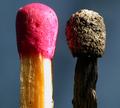
| 02/03/2003 07:28:46 AM | Mis-matchby Fibre OptixComment: Incredble bacro, but it seems as if your lens has a few shortcomings, or that you have attempted to enlarge it a little too much, or that you have saved it with too hig compression. Especially around the edge of the unused match-head, there seems to be a lot of banding and JPG artifacts. Also, the side of the match is a bit over exposed. Despite of this, I am giving this picture a 9. | | Photographer found comment helpful. |
| 02/03/2003 05:06:42 AM | Friday Nightby DennisFComment: A great picture indeed (Lovely marguaritas!) but I don't see any "after" ? |
| 02/03/2003 04:56:30 AM | |
| 01/27/2003 12:05:44 PM | |
| 01/27/2003 12:00:44 PM | |
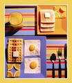
| 01/27/2003 11:52:28 AM | "OCB: Obsessive Compulsive Breakfast" by KickDrum5150Comment: Hehe.. A brilliant solution to the title, and a fabulous title. However, I think the frame is hogging way too much of the image, and you cropped the plates a bit harshly, which lost you the 10-vote from me. (9) |
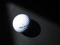
| 01/27/2003 11:47:36 AM | Evolved Squareby Swami GComment: Good idea, and cool lighting. But why did you let the ball burn out on the top? I think you could have pulled the exposure down by at least half a stop, and gotten a far more impact-full image. (6) |
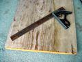
| 01/27/2003 11:46:14 AM | Amatuer woodworker's dream-a square and old barn woodby kposeyComment: Sorry, I just have to nitpick; It's spelt "Amateur". Otherwise I think your image lacks contrast.. It is very pale, and the light is rather undramatic, I love the way you decided to solve the assignment though, and the right-angle tool certainly adds to the image. (6) | | Photographer found comment helpful. |
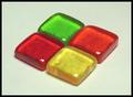
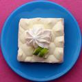
| 01/27/2003 11:41:41 AM | Shapes, Color, and ... Pie?!by indigo997Comment: Great idea, but not sure about the wool the plate is placed on - a finer textile (cotton? Filt?) would probably have been more suitable. Not a bad shot, however. (7) | | Photographer found comment helpful. |
|
Showing 431 - 440 of ~473 |
Home -
Challenges -
Community -
League -
Photos -
Cameras -
Lenses -
Learn -
Help -
Terms of Use -
Privacy -
Top ^
DPChallenge, and website content and design, Copyright © 2001-2025 Challenging Technologies, LLC.
All digital photo copyrights belong to the photographers and may not be used without permission.
Current Server Time: 08/20/2025 07:09:32 AM EDT.
|