| Image |
Comment |
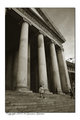
| 06/29/2006 04:41:30 PM |
Ex Votoby Rino63Comment: I have to agree with the previous comment that the angle is great in this photo, I like how the steps balance out the sky above. And the color tone of the photograph is a good match for this photo. Only nitpick would be the small bit of bright building we see along the right edge in the middle but that could go either way. |
 Photographer found comment helpful. Photographer found comment helpful. |
| 06/29/2006 04:36:43 PM |
nowhere but upby skewsmeComment: I think this would have made a fine entry for the Desolation challenge. A couple of things about the photo. The natural framing on the right seems to be the tree with the ladder against it so the darker area beyond it doesn't seem to fit with the picture especially since everything is so close to us but beyond the tree it is further away and in darker shadow. I would also like to see a little breathing room at the bottom of the photo, it seems to be cut quite close to the junk there.
On a side note I do like how even though you have the desolation theme we also see life springing up around it in the form of the young trees. |
| Photographer found comment helpful. |
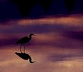
| 06/29/2006 04:11:34 PM |
Heron 30055.jpgby kari1Comment: Nice capture on this one, great pose by the bird and great lighting. It seems there is some haloing around the bird, maybe from too much sharpening(?) if it's due to saving for web then disregard. The only change I would like to see is to crop some of the dark off the top edge, it's nice that the photo progresses from light to dark but there is just no need for that much dark space up there. |
| Photographer found comment helpful. |
| 06/29/2006 03:58:45 PM |
4424.jpgby LKMoteComment: This is a lovely photo. The brown coloring of the horse is beautiful. Nice sharpness on horse and rider and the moutains in the back make a nice backrop. I have to agree with the previous commentor about the cropping. In fact, I would prefer more space just in front of the horse so it would appear they are going somewhere instead of just up against the edge of the photo.
Also, good job on the exposure. It would have been all too easy to blow out the whites of the rider. |
| Photographer found comment helpful. |
| 06/28/2006 05:02:02 PM |
Eco by TechoComment: Absolutely wonderful photo. Great setup and great lighting. |
| Photographer found comment helpful. |
| 06/28/2006 12:34:45 PM |
Urban Ledgend - "Always check the back seat!"by TajhadComment: With his hands on the steering wheel I would assume that he is driving which makes the harsh lighting coming from above seem very out of place. Maybe if it had been lit from straight on or from the rear as if by headlights it would match better. |
| Photographer found comment helpful. |
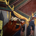
| 06/28/2006 12:29:53 PM |
Restoring monastery wall-legendby lensblurComment: This is about restoring the art but the darkest part of the picture is the area where this is taking place and the lighter corner of the picture is the bland ceiling. Wish it had been the other way around. |
| 06/28/2006 12:26:27 PM |
|
| Photographer found comment helpful. |
Home -
Challenges -
Community -
League -
Photos -
Cameras -
Lenses -
Learn -
Help -
Terms of Use -
Privacy -
Top ^
DPChallenge, and website content and design, Copyright © 2001-2025 Challenging Technologies, LLC.
All digital photo copyrights belong to the photographers and may not be used without permission.
Current Server Time: 08/04/2025 05:30:32 PM EDT.