| Image |
Comment |
| 04/19/2005 09:25:57 AM |
Another Day in Paradiseby alanfreedComment: Looks a little windy but certainly it looks like a place worth visiting. I like the slight curve in the beach, which is mimicked in part by the palm. Composition is good, and those puffy clouds always makes things better. Certainly postcard material. |
 Photographer found comment helpful. Photographer found comment helpful. |
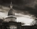
| 04/19/2005 09:23:29 AM |
Twilightby TooCoolComment: I like the contrast between building and sky. If only nature would not have put those trees where they did, though! A slight halo around the building on the bottom left but overall it's a good shot. |
| Photographer found comment helpful. |
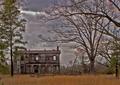
| 04/19/2005 01:08:09 AM |
A House in the Countryby dahkotaComment: The house looks interesting but the sky just ruins it for me. I like the contrasting orange in the grass too although it looks like it could do with a slight rotation. |
| Photographer found comment helpful. |
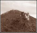
| 04/19/2005 12:59:59 AM |
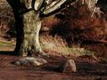
Burg Mausby reeveyComment: The composition is good but it seems to be lacking contrast and a full tonal range. There does not appear to be any true blacks in the image and as such it comes across as a little flat. Using a black point and a slight curves adjustment would likely improve it immensely. I understand you were going for an olde world feel but a more subtle sepia tone may have added to the mood. |
| Photographer found comment helpful. |
| 04/19/2005 12:54:18 AM |
Elizabethby twm122Comment: The full frame composition is good and so is the use of the flowers as props. The soft focus technique can certainly be effective but as it is applied here I dont think it really works. The 'glow' has made several sections of the image overexposed, namely the ribbon in her hair and various spots in the background. The eyes are naturally draw to the lightest section of a photograph first and so these areas are where the viewer mostly notices. In the case of the ribbon this distracts from her face. Even though you want the face soft you still want to have the details sharp, namely her eyes. Creating the effect on a new layer allows you to use the eraser tool to delete the effect in certain areas and restoring the original sharpness. In this case her blue eyes would be greatly enhanced by having them sharp to engage the viewer. |
| Photographer found comment helpful. |
| 04/19/2005 12:43:50 AM |
Spring Is Here!!by rexComment: I'm partly wondering if you boosted the green color as the flower seems to have a slight green cast. The details are good, not too soft, but could do with a little more breathing room on the left hand side. |
| Photographer found comment helpful. |
| 04/19/2005 12:41:53 AM |
Coming home from long day work (the raven)by petur-fotoComment: I almost missed the bird completely. My eyes are being drawn to the central orange section. I think overall the bird is a little too small to be much of a focal point and the rest of the image doesnt really hold my attention. |
| 04/19/2005 12:39:25 AM |
Mourning in St. Peter's Square - The Night John Paul II Passed Awayby sammy_stecchinoComment: The focus seems to be a little off, more than likely due to the low light conditions. There is also a section on the right side that is a different color (gray) to the rest of the image and so stands out as a slight distraction. A crop on the right to remove the area could possibly help. Additionally cropping out a lot of the negative space at the top would put more emphasis back on the pope's image. |
| Photographer found comment helpful. |
| 04/19/2005 12:22:48 AM |
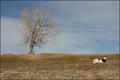
Foretaste of Springby NickBallComment: The clouds add a lot of interest to the sky, but I feel overall the harsh lighting makes the image a little flat. I like the composition and the balance of the tree and the cow. Although black and white, the cow adds a nice contrasting color as well. Just needed different lighting conditions to bring it alive. |
| 04/19/2005 12:20:23 AM |
Aurora Arborealisby OlyuziComment: The colors almost depict an autumn/fall foliage. The contrast is good and adds a more dramatic mood to the shot. I'm not sure if it is the influence of the riverbank but it looks like it could do with a slight rotation. |
| Photographer found comment helpful. |
Home -
Challenges -
Community -
League -
Photos -
Cameras -
Lenses -
Learn -
Help -
Terms of Use -
Privacy -
Top ^
DPChallenge, and website content and design, Copyright © 2001-2025 Challenging Technologies, LLC.
All digital photo copyrights belong to the photographers and may not be used without permission.
Current Server Time: 08/02/2025 12:23:54 AM EDT.