| Image |
Comment |
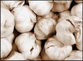
| 12/02/2003 10:55:06 PM |
garlic breathby jackditchComment: Ewww garlic! Composition is good and it's nicely sharp and clear. A few of the bulbs near the top seem slightly overexposed and the detail has been lost somewhat. They are all very similar color/tone and so could probably have done with a little more contrast. |
 Photographer found comment helpful. Photographer found comment helpful. |
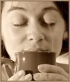
| 12/02/2003 10:52:46 PM |
Ahhhhhhh.... nothing like the smell of coffee in the morning.by kosmikkreeperComment: I can certainly relate to this, and what a great smell it is. I like the tone and the border, it reminds me of coffee. The light reflection in the coffee mug is a little distracting but I understand some things can not be avoided. The image is a little soft, almost like it has been through neatimage but not quite as severe, but I suppose this could add to the dreamy mood. I like the idea of capturing the steam, but the placement is not the best- it is almost as if she is crying into the mug. |
| Photographer found comment helpful. |
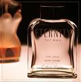
| 12/02/2003 05:08:48 PM |
Just For Men!by agwrightComment: Looks like an advertising campaign. The focus on the front bottle is good, lighting is wonderful, the cheeky bottle(?) in the background adds a sense of fun and sensuality. I even like the border on this. Cant really see anything I'd improve. Very professional-looking shot, well done. |
| Photographer found comment helpful. |
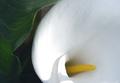
| 12/02/2003 03:26:38 PM |
Aroma is inspired by natureby rameviComment: I like the mix of white and green, they are very contrasting and complimentary colors. Edges are a little soft but it's quite an abstract image that I think it doesnt really matter. I would have liked to have seen a little more vibrant color, but white is so hard to get vivid without losing some details. The shadow on the petal is a little bit distracting, but not overly so. I like it. |
| Photographer found comment helpful. |
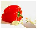
| 12/02/2003 03:22:35 PM |
Comfort Foodby CatherineComment: The right side just above the knife seems very blown out/overexposed/too bright. A lot of the details there have been lost. Because of that I'm not really sure about the composition, although the knife would be the leading diagonal line from the corner to the pepper that seems to be the main focus. With that in mind I wonder about the reasons for the garlic cloves. The red of the pepper is very vibrant. |
| Photographer found comment helpful. |
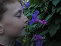
| 12/02/2003 03:14:37 PM |
Smell The Purpleby ShovalComment: The kid's face is a little soft (chocolate as a bribe perhaps?), and I personally would have cropped out the ear completely, but other than that the placement is good. Similiarly the leaves/flowers are a little dark and the buds seem to be closing so I assume it was fairly late at night. There is either a tree or a plant limb of some kind very near his forehead and it almost looks part of his features. The bottom right has a blank area of black that stops the flow/pattern of the leaves. It's a good shot, but I think a different time of day would have helped it greatly. |
| Photographer found comment helpful. |
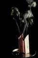
| 12/02/2003 03:06:36 PM |
Papier d'Arménieby sergutComment: Not sure if there is a story there with the title and the type of paper that's burning, but it sounds expensive. The composition is good, no bad reflections on the chrome/metal disk (which is good), although I think the edge may be cropped a little too close. The lighting is good, especially on the smoke, which I understand to be a difficult thing to photograph correctly. It's a good shot. |
| Photographer found comment helpful. |
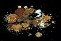
| 12/02/2003 03:02:58 PM |
Stink Bombby ChezComment: Never seen, used, or smelt a stink bomb so no personal reference here. The colors are interesting and it's certainly very abstract. Within the context of a scent/aroma challenge I could envision a scent coming from this. I dont see any areas where you could improve on it. |
| Photographer found comment helpful. |
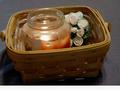
| 12/02/2003 02:57:39 PM |
Aroma of Mulberryby Crafty SueComment: Not sure if you put the border at the bottom to eventually add some text but without the text (which isnt allowed on DPC) it looks kinda odd. The image itself is slightly blurry, possibly due to low lighting. The angle of the basket doesnt really add anything and so I think it would have been better straight. Cropping it so it has the same amount of space on either side would help with balancing up the image too. It does an ample job of depicting a scent/aroma. |
| Photographer found comment helpful. |
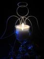
| 12/02/2003 02:04:28 PM |
Scent of Angelsby byshenComment: I like the blue tone of the metal on the left wing, but underneath it appears so dark that I'm not sure what it is. Because it is so dark it only really adds as a distraction. The right wing has also disappeared at the bottom. The subject is an interesting one, and the area that is lit by the candle is good. Looking at the reflection on the votive I'm wondering if this was lit by a computer monitor hence the blue glow. A few things you could try - use another two candles on the left and right either behind or off to the sides of the holder to illuminate the wings and below. If you were going specifically for the blue glow, which I dont blame you as I like it, you could try two (or even one) small flashlight with blue cellophane or a gel on it. It's a good shot, but I think if you play around with it you can get some really great images from it. |
Home -
Challenges -
Community -
League -
Photos -
Cameras -
Lenses -
Learn -
Help -
Terms of Use -
Privacy -
Top ^
DPChallenge, and website content and design, Copyright © 2001-2025 Challenging Technologies, LLC.
All digital photo copyrights belong to the photographers and may not be used without permission.
Current Server Time: 08/08/2025 07:22:20 PM EDT.