| Image |
Comment |
| 01/29/2004 10:05:25 AM |
Equineby jonpinkComment: Good texture of the fur, nice coloring, good dof too. Interesting composition also. |
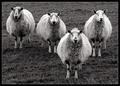
| 01/29/2004 09:57:28 AM |
Four of a Kind by KonadorComment: This is cute, I like it. The black and white is a good choice to give it a nice even feel, and also a harsher/docu-photograph feel. The composition is good with the slight V. It's full of personality. |
 Photographer found comment helpful. Photographer found comment helpful. |
| 01/26/2004 12:30:36 AM |
Simple Pleasuresby moodvilleComment: Thanks for all the comments and scores. This was taken inside the chimp building behind 8 layers of ape-proof glass at the local zoo. He was hanging up in the rafters, clinging to a grated window where the sun was streaming in (no studio lighting was involved). It was shot at 300mm at iso 800. |
| 01/24/2004 09:19:37 AM |
Double Takeby jenesisComment: The quality of this shot is not the best. It's slightly blurry, and I wonder if this was taken in a speeding car. The sign has humor value, but the background is too distracting and 'close' to the sign. Compositionally it's fine. |
| Photographer found comment helpful. |
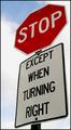
| 01/24/2004 09:15:57 AM |
2 in 1by HRoxasComment: The sign is very clear, vibrant, and straight! The dof is excellent to isolate the sign, yet have some context in the background without being too distracting. The second sign compliments the first well and it gives a great depth to the image. |
| Photographer found comment helpful. |
| 01/24/2004 09:14:00 AM |
"NO SHOOTING AREA"by JasonComment: It's the back of the sign so I'm assuming it isnt an actual no shooting area sign and the title is just there for the humor. That said it's an interesting shot. The background of the blue skies and the mountains is great, and I like the foreground of the road, although it's a tad dark. That one star-shaped light coming through the hole also adds interest. Unfortunately the perspective of the sign makes it look tilted, which is slightly offputting. Overall it's a good shot. |
| Photographer found comment helpful. |
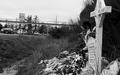
| 01/24/2004 09:10:21 AM |
A sign to slow downby ccraftComment: A slight step to your left and a step back so that the cross was full in the frame and could be read a tad more easier would have improved this a little more, I think. It's an interesting shot, certainly makes one think while viewing it. The black and white was a good choice to make it seem somewhat harsher. An unfortunate photo opportunity, but a good message to send. |
| Photographer found comment helpful. |
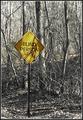
| 01/22/2004 10:06:31 AM |
Confusedby MarjoComment: I guess having a simple shot of a sign straight on is a little boring, but not so sure that having it slightly askew is much better. The first thing I think is that it's tilted. Beyond that the sky background is good, there's some nice blue to it. The image is also sharp and clear. I just do not find much interest with it, sorry. |
| Photographer found comment helpful. |
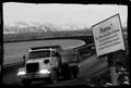
| 01/22/2004 10:02:33 AM |
Islandroad?by garlicComment: I cant make up my mind if I like this or not. The sign is well placed in the shot, I have no idea what it says, but it looks interesting. The background of the mountain range is great, and I like the bend of the road. I actually even like the border! The truck gives the scene some movement, but it looks kinda blurry... that said I think that's partly where the mood comes from. I dont want to say it's gritty, and I'm not sure exactly what it is, but... I like it! |
| Photographer found comment helpful. |
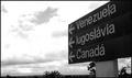
| 01/22/2004 09:58:15 AM |
|
| Photographer found comment helpful. |
Home -
Challenges -
Community -
League -
Photos -
Cameras -
Lenses -
Learn -
Help -
Terms of Use -
Privacy -
Top ^
DPChallenge, and website content and design, Copyright © 2001-2025 Challenging Technologies, LLC.
All digital photo copyrights belong to the photographers and may not be used without permission.
Current Server Time: 08/09/2025 01:32:50 PM EDT.