| Image |
Comment |
| 03/04/2004 07:09:04 PM |
W is for Warmby jrs915Comment: Having the second lick of flame in the back helps this image a lot, it gives it some depth. It is indeed a 'warm' image. |
 Photographer found comment helpful. Photographer found comment helpful. |
| 03/04/2004 07:07:44 PM |
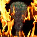
by soccerdadComment: Interesting idea with mixing the mystery of the mask with the fire - gives it a somewhat mythical feel. |
| Photographer found comment helpful. |
| 03/04/2004 07:06:17 PM |
Rock 'n Flameby DrakeComment: The gradient of the background is good and a nice tall flame with interesting color. There is something about the rock that I do not like, but I cant really put my finger on it. Overall it's a good shot. |
| Photographer found comment helpful. |
| 03/04/2004 07:02:58 PM |
Exhaustedby e301Comment: Good silhouette of the structure, nice composition, the fire is effective as the only 'warm' color in the shot. Some noise in the sky but I dont think it distracts too much. |
| Photographer found comment helpful. |
| 02/22/2004 09:41:15 AM |
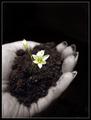
Genesisby sherComment: Very cool idea, and great use of DOF to isolate the flower. Great shot! |
| Photographer found comment helpful. |
| 02/18/2004 01:11:18 PM |
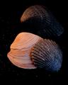
shell contrastsby vtruanComment: Not sure if those specks are sand or not but I have to admit to not being much of a fan of them. The textures of the shells are good, and the lighting is low but enough to give them a mood. The top shell is a little darker than the others and has lost some of its details, but that's just a minor nitpick. |
| Photographer found comment helpful. |
| 02/18/2004 01:08:57 PM |
In The Cave of my Soul by heidaComment: Interesting idea and a fairly surreal, moody image. The texture of the rock and ground is good, the light is consistent and enough to show what it is but also leave some dark shadowed areas. The person adds interest, and color, and begs the question of why he is there, what does it mean etc. An original idea. |
| Photographer found comment helpful. |
| 02/18/2004 12:15:26 PM |
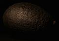
Dark Fruitby jab119Comment: Hrm, avocado? The light is good, enough to show the great texture of the fruit but not too much to completely blow it out. I also like how it fades out into pure black. The disconnected 'thing' on the right, I assume the stem, is a little distracting simply because it's not connected to it, but not overly so. |
| 02/18/2004 12:12:03 PM |
Black hole thoughtsby dasserComment: The composition is good - I like the arc of the 'thing' and also the placement of the boy. Not usually a fan of the part black and white/part color, but this works to contrast the balls against the subject. I like the lower circular light flashes, but the two near the middle that looks like a result of the camera flash are a little too 'camera flash' looking and spoil the effect. As this was advanced editing I think if you had cloned them out it would have improved the shot greatly. |
| Photographer found comment helpful. |
| 02/18/2004 12:07:45 PM |
Exclamation!by tolovemoonComment: First thing I notice is that the 'horizon' line is tilted, not usually a good thing unless it's an extreme angle or for a set mood. Seconly the lighting seems a little dull. The white is white, but it's not too bright, which is what you normally see in product shots like this. What light reflections there are are placed well and not too strong. This also looks like you placed the item flat on the background as there is 'texture' in the black nearer the top. I'm guessing you did that to reduce shadow, but sometimes shadow can be a good thing to add dimension and depth to an image. |
| Photographer found comment helpful. |
Home -
Challenges -
Community -
League -
Photos -
Cameras -
Lenses -
Learn -
Help -
Terms of Use -
Privacy -
Top ^
DPChallenge, and website content and design, Copyright © 2001-2025 Challenging Technologies, LLC.
All digital photo copyrights belong to the photographers and may not be used without permission.
Current Server Time: 08/12/2025 04:07:52 AM EDT.