| Image |
Comment |
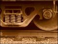
| 03/14/2004 09:27:28 PM |
Make Tracksby justineComment: Could probably do with a little more contrast and/or sharpening but the composition is good, and the sepia tone adds to the age of the design. Good shot. |
 Photographer found comment helpful. Photographer found comment helpful. |
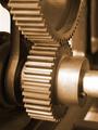
| 03/14/2004 09:24:59 PM |
Golden Cogsby browntComment: Composition is good, wonderful toning, nice detail in the cogs, exposure is good, meets the challenge. Nicely captured! |
| Photographer found comment helpful. |
| 03/14/2004 09:23:22 PM |
|
| Photographer found comment helpful. |
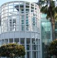
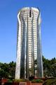
| 03/11/2004 11:47:28 AM |
ontario centerby loudzgamerComment: Interesting building and a good shot. There appears, however, to be something missing. I'm not sure what it is, and I dont really see anything bad about it, but it just doesnt have that 'wow' factor. It's a good shot of a good building, but it doesnt seem to grab my attention. If you know what I mean! |
| 03/11/2004 11:44:38 AM |
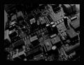
Final Approach to Circuit City at Duskby Everyday ReneeComment: I admit that without the title this probably wouldnt be as neat an image as it is with it. I love the dark black and white, the contrasts are great. The angle compliments the title by making me think of a final turn made by a plane. The sparkly bits really add that 'ting' to the shot too, and it does indeed look like a city. I'm not one for circuit bord shots, but I do like this one as it has interest. |
| 03/11/2004 11:40:21 AM |
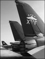
F-14 Tomcatby kellianComment: Good use of filling the frame with the subject and yet still making it easily recognisable. I also like the second plane in the background to give it more depth. The black and white has good contrasts and works for this image. |
| Photographer found comment helpful. |
| 03/11/2004 11:38:03 AM |
Timeless Timepieceby neilmwilsonComment: This almost looks like an illusion as although my brain is telling me that they are both facing toward me my eyes are thinking they are both facing/opening away from me too. Very trippy! As for the image itself, I like it. The yellow cast works well to age up the image and I like the 'dirty' clock face. Looking at it more it looks like a clock instead of my initial thought of a pocketwatch, which explains the 'column' at the back that seemed a little distracting. |
| Photographer found comment helpful. |
| 03/08/2004 05:09:14 PM |
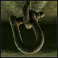
Locked solidby e301Comment: The tones create such a great moody image. Wonderful lighting, good use of light/shadow to enhance the mood, great subject choice, and nice detail, texture, and sharpness. A really nice image. |
| Photographer found comment helpful. |
| 03/08/2004 05:07:19 PM |
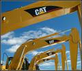
Digging Designby BeagleboyComment: Interesting 'creation' of the mechanical arch. The yellow of the machines goes great with the blue sky. Nice detail and sharpness. |
| Photographer found comment helpful. |
| 03/08/2004 05:05:22 PM |
Up in Flamesby tyt2000Comment: Great use of foreground and background elements to 'create' an interesting image. This certainly does look like a tower on fire. If I were to be very picky I would suggest cropping off the bottom just past the plague so it gives it a more 'natural' look/feel and not just a building and a work of art. |
| Photographer found comment helpful. |
Home -
Challenges -
Community -
League -
Photos -
Cameras -
Lenses -
Learn -
Help -
Terms of Use -
Privacy -
Top ^
DPChallenge, and website content and design, Copyright © 2001-2025 Challenging Technologies, LLC.
All digital photo copyrights belong to the photographers and may not be used without permission.
Current Server Time: 08/12/2025 05:54:00 AM EDT.