| Author | Thread |
Comments Made During the Challenge  |
|
|
03/14/2004 09:27:28 PM |
|
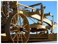
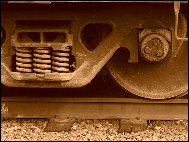
Could probably do with a little more contrast and/or sharpening but the composition is good, and the sepia tone adds to the age of the design. Good shot. |
|
 Photographer found comment helpful. Photographer found comment helpful. |
|
|
03/11/2004 08:06:02 PM |
|
Nicely done the composition is good, sepia works well. The crop could have been a touch lower from the top to take out that thin strip along the top. It really pulls my eye away from the rest of what is a really nice shot. |
|
| Photographer found comment helpful. |
|
|
03/09/2004 03:44:14 PM |
|
Nice capture with great composition. I especially like your choice in sepia toning. |
|
| Photographer found comment helpful. |
|
|
03/09/2004 12:40:08 AM |
|
OK. I like the sepia (if that's what you were going for), although I got slammed on my last sepia entry because it seemed to be a different color on everyone's monitor (some said it was green, some said it was yellow...) However, I think the image is a little flat somehow and the fact that the track is slightly crooked irks me... |
|
| Photographer found comment helpful. |
|
|
03/08/2004 11:55:10 AM |
|
I really like how you used the sepia tone and old feel to capture this image. Good luck! |
|
| Photographer found comment helpful. |
|
|
03/08/2004 01:35:34 AM |
|
interesting. I would like to se it a touch darker... so the blacks are black. good use of sepia.. i like the DOF... perhaps the top edge is a little to 'almost in line' with that line on the train. |
|
| Photographer found comment helpful. |
Home -
Challenges -
Community -
League -
Photos -
Cameras -
Lenses -
Learn -
Help -
Terms of Use -
Privacy -
Top ^
DPChallenge, and website content and design, Copyright © 2001-2026 Challenging Technologies, LLC.
All digital photo copyrights belong to the photographers and may not be used without permission.
Current Server Time: 06/28/2026 08:10:43 PM EDT.