| Image |
Comment |
| 03/05/2004 12:05:28 PM |
The Burning Issueby xenoaxleComment: The rocks are good, adds texture and interest. The flames are not bad and show some color shift. Only nitpick is the large dark area at the bottom - I would have prefered more of the rocks or more flame there as it seems to be where my eyes fall. |
 Photographer found comment helpful. Photographer found comment helpful. |
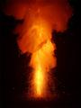
| 03/05/2004 12:03:44 PM |
Detonationby weavercComment: I like the orange smoke plume, very ethereal. The light streaks at the bottom are interesting too. Nicely captured. |
| Photographer found comment helpful. |
| 03/05/2004 12:02:35 PM |
Slammin'by karmatComment: Interesting idea, certainly has visual impact. |
| Photographer found comment helpful. |
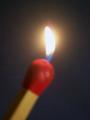
| 03/05/2004 12:01:01 PM |
match this!by tolovemoonComment: The match seems out of focus and the flame is a little too bright, although it does have some color at the bottom of it. Good diagonal on the match. |
| Photographer found comment helpful. |
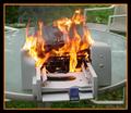
| 03/05/2004 11:59:31 AM |
Printer Malfunction!by deadd0gComment: The concept is good and I really hope that was an old printer you torched! I'm not usually one to complain about borders but the thick orange part of the border tries to steal a lot of eye time from the actual picture - it may be because the image space is quite small. |
| 03/05/2004 11:55:33 AM |
"Zippo - de - do Dah"by tfarrell23Comment: I like the lighting of the shot and the shadow it creates. The texture of the wood table is good also. What I dont like is the flame itself - it's rather large and mostly just a big white blob with no detail or shifts of color. The idea is fine, the set up is fine, the flame isnt fine. |
| Photographer found comment helpful. |
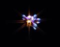
| 03/04/2004 11:01:48 PM |
Dying Flamesby JB707Comment: Interesting idea, almost looks like a star. I personally find it a little too centered and think it would have more dramatic effect in a corner or on a third line. |
| Photographer found comment helpful. |
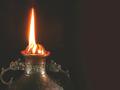
| 03/04/2004 07:20:10 PM |
fire & guardian dragonsby kenboComment: Composition is good but the flame is a little overexposed. A slightly darker image would maybe have helped add some detail in the flame and also darkened the background some, which looks kinda streaky. Else you could have moved the lamp farther away from the background so it didnt show as much. |
| Photographer found comment helpful. |
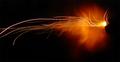
| 03/04/2004 07:17:23 PM |
A Shot in the Darkby smittyComment: Fun shot. I like the 'plume' of orange and the streaks of light also add interest. Not sure what it is, but I dont think that really matters. Only nitpick is wishing that the streaks didnt end off the frame. |
| Photographer found comment helpful. |
| 03/04/2004 07:14:05 PM |
Gas Jetsby DiamondPeteComment: A classic shot but not quite the classic composition. Looks like a little camera shake on the bottom of the flames but I think it blends in with the whole mood of the shot. An interesting abstract. |
| Photographer found comment helpful. |
Home -
Challenges -
Community -
League -
Photos -
Cameras -
Lenses -
Learn -
Help -
Terms of Use -
Privacy -
Top ^
DPChallenge, and website content and design, Copyright © 2001-2025 Challenging Technologies, LLC.
All digital photo copyrights belong to the photographers and may not be used without permission.
Current Server Time: 08/12/2025 01:54:08 AM EDT.