|
|
|
Showing 471 - 480 of ~1214 |
| Image |
Comment |
| 05/05/2004 04:28:55 PM | Rusted sunriseby pinoComment: Color/toning: The typical colors of a sunset - nicely golden, warm, and inviting.
Composition/cropping: The horizon looks a little tilted, but the placement of the balcony and sun on opposing sides balances it out nicely.
Subject: I'm assuming the balcony fence is the thing that is rusty. Unfortunately because of the silhouette it's not possible to see whether the fence is rusty or not. It's easy enough to assume it is, but I dont immediately think of rust when I look at the shot.
Technical: The sun is a little overexposed, horizon tilted, but the dog and balcong is nicely silhouetted. There also seems to be some jpeg compression around the balcony.
Artistic: It's a very peaceful shot and I really like that the dog is included and not just the balcony. It tells a story and it feels like I'm right there.
Overall: It's a good shot but I'm just not getting the feeling of rust from it. |  Photographer found comment helpful. Photographer found comment helpful. |
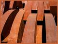
| 05/05/2004 04:23:12 PM | abstractby rhipsterComment: Color/toning: Great vibrant rusty browns of various shades.
Composition/cropping: A good mix of curves and lines, certainly supporting the abstract look.
Subject: No idea what it is but that's partly why I like it. The color, texture, curves, and even the shadows all make up a chaotic pattern that has interest and meets the challenge.
Technical: I dont see anything that needs changing.
Artistic: It has a great flow like waves of rusted metal.
Overall: Vibrant, flowing, clear, and with no distractions. It's a good abstract image. | | Photographer found comment helpful. |
| 05/05/2004 04:18:29 PM | Old Masterby jmritzComment: Color/toning: What a great rust color! The image also has the various hues of different rusts that blends well together.
Composition/cropping: There is a lot of detail here to take in and I think it's nicely evened out over the shot.
Subject: I have no idea what it is, but it doesnt matter. The texture of the rust is great, as is the color. The curves and lines keep the eyes flowing over the image, taking in all the details. It is very easy to believe there are a lot of hidden stories here. Has interest and meets the challenge.
Technical: Great texture and color, the harsh light works well with the subject matter and the shadow of the lock is not distracting at all. The chainlinks on the right are a little sharper than the left, but it really doesnt matter in the long run.
Artistic: It's bright yet atmospheric, great texture, and plenty of potentional stories.
Overall: It has interest and is backed up with great color, texture, and clarity. A great image! | | Photographer found comment helpful. |
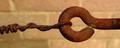
| 05/05/2004 04:09:51 PM | Holdingby paynekjComment: Color/toning: The overall tone of the image is good, the yellow of the background bricks compliments the rusty brown of the hook.
Composition/cropping: It has a panorama feel with the cropping as is and I think that helps give it an elongated feel, it also works well to eliminate the uncessary background.
Subject: The rust texture is great. The hook isnt really interesting but it has a somewhat abstractness to it that makes it appealing with the shape and texture.
Technical: Good dof, lighting, sharpness - dont see much need to change anything.
Artistic: As an abstract and concentrating on the texture and shape it's good. Is that cobwebs?
Overall: It's a good image, technically fine, but lacks the wow factor. | | Photographer found comment helpful. |
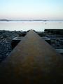
| 05/05/2004 10:49:34 AM | Rusted Rail to the Seaby theSajComment: Toning/Color: It seems almost slightly desaturated with muted colors, and I think that works well for the mood of it.
Composition/cropping: Excellent use of perspective and leading line.
Subject: I like how the rusty rail introduces us to the rest of the scene. It's a dominant subject and yet it doesnt steal the entire focus either. Certainly meets the challenge.
Technical: I dont see anything technical here that I would change.
Artistic: I have a feeling of duality when I see this. The lower two-thirds is rusted and dark and yet the top third is light and serene. There could very well be meaning in that.
Overall: Well-executed, relaxing, pleasant mood, just a great image! | | Photographer found comment helpful. |
| 05/05/2004 10:41:42 AM | Exhaustedby alanbataarComment: Toning/color: You certainly got a good rust color to the shot, and I like the matching tone in the background although it seems to have a little bit of noise.
Cropping/composition: The composition is straight forward but it's good. The crop seems to center on the item(s) themselves without extra negative space, which is good.
Subject: They look like items from a car, but I'm not sure, and that makes them somewhat interesting to me. I see them as a constructed work of art on display. Certainly meets the challenge.
Technical: It doesnt have the sharp, clean look that a lot of studio set ups usually have. Some of the shadows work but there are others that seem to get in the way of the textures.
Artistic: Rust texture, light and shadow, gradient background, almost abstract feel.
Overal: It has potential but I think there are a few technical issues that stop it from being great - mostly the shadows, sharpness of image, and noise in the gradient background. | | Photographer found comment helpful. |
| 04/19/2004 08:59:58 PM | | | Photographer found comment helpful. |
| 04/19/2004 12:42:01 AM | | | Photographer found comment helpful. |
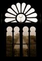
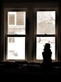
| 04/18/2004 11:43:22 AM | Waitingby mariomelComment: Nice framing and I like the girl's silhouette, both the toning and the hat give it a nice aged feel. Not really a fan of the very bright almost washed out view out of the window, though. Very nice overall mood and presentation. | | Photographer found comment helpful. |
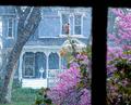
| 04/16/2004 12:20:14 PM | Spring Shower Through Old Glassby vtruanComment: At first I thought it was snow, but after seeing the title I'm guessing it's actually rain. Well there goes 'wow snow and flower petals in the same shot' theory. The colors are vibrant, the rain/show makes it more different than the standard view of next door through a window look. The placement of the frame is good, but the lines are not very straight. Not a bad shot. | | Photographer found comment helpful. |
|
Showing 471 - 480 of ~1214 |
Home -
Challenges -
Community -
League -
Photos -
Cameras -
Lenses -
Learn -
Help -
Terms of Use -
Privacy -
Top ^
DPChallenge, and website content and design, Copyright © 2001-2025 Challenging Technologies, LLC.
All digital photo copyrights belong to the photographers and may not be used without permission.
Current Server Time: 08/10/2025 12:09:52 PM EDT.
|