| Image |
Comment |
| 05/12/2004 11:34:05 AM |
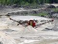
Screening Plantby amsmythComment: Hrm, to be honest this doesnt really do much for me. The lighting is fairly flat and the subject doesnt hold much interest for me. The machine is in the center of the image and although the dirt road kinda curves toward the center it doesnt really lead the eye there. I would imagine there would be some good textures in the various piles of sand and rock and so maybe going at a different time and playing with light and shadow on those surfaces could yield some interesting studies. |
 Photographer found comment helpful. Photographer found comment helpful. |
| 05/12/2004 11:29:26 AM |
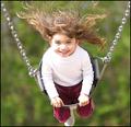
Bad hair dayby TLL061Comment: What a fun shot! It's full of energy and action and certainly a different perspective. The only obvious negative is the highlight on the left side of her face and shoulder that is a little blown and so a little distracting. But the energy of the shot really wins out. |
| Photographer found comment helpful. |
| 05/11/2004 12:50:30 PM |
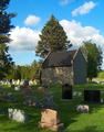
Nice place to visit...by bobdaveantComment: An interesting contradiction, especially coupled with the title. It is usual to see cemetery pics in black and white or a dark sepia tone and this shot is a bright sunny day with vibrant green. The clouds are great, and I love the grass. The building makes it stand out from just another image with lots of headstones. I also like the shadows of the tree branches on the stones and the areas of light and shadow in the scene. |
| Photographer found comment helpful. |
| 05/11/2004 12:47:26 PM |
Ensalada de frutaby photomComment: The backlighting really brings out the great color and detail of the kiwis. Although the red of the strawberry is muted a little because of it being on top of the green kiwi I think having it there adds interest and breaks up the repetition of the other fruit. I would be curious to see the strawberry being backlit directly amid the kiwis so that it was a lot stronger and vibrant like the others but that's mostly out of curiosity. And well done for cutting the slices so thin! |
| Photographer found comment helpful. |
| 05/11/2004 12:43:55 PM |
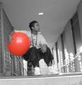
New Ballby RohnComment: It has a somewhat surreal look to it. The dappled lighting on the wall is good, and the mix of color and black and white is interesting. Having him sit in the hallway is good, but the tilted line of the step gives the image a skewered look (unless that was your intention). The focus is a little soft, possibly due to low light and/or him moving when the shot was taken. |
| Photographer found comment helpful. |
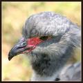
| 05/11/2004 12:40:28 PM |
Headshotby tyt2000Comment: Great details in the features and the beak. Very sharp and good exposure. Good composition too. The lower right corner looks a little odd to me, although not exactly sure why. It looks like it has the green of the background where the body should be, and an odd OOF section of gray. Even so, it's a good bird portrait. |
| Photographer found comment helpful. |
| 05/11/2004 12:36:57 PM |
WTC-Amishby Herblacklist12Comment: The top right corner is very bright in comparison to the rest of the shot, specifically the sign, and I'm not too sure about the composition but also not sure how you could 'better' it either. The color combo of blue and yellow go well together, and the tear and the overall weathered appearance of the sign adds interest. |
| Photographer found comment helpful. |
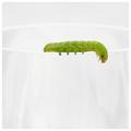
| 05/11/2004 12:34:28 PM |
Garnishby crabappl3Comment: I like the minimalism of the shot and the basic white and green color combo also gives it a nice simplistic look. The lack of reflections on the glass is good, but I'm glad there are some marks so you still know that it is indeed a glass. The composition is great, and the detail in the caterpillar is excellent. Wonderful shot! |
| Photographer found comment helpful. |
| 05/11/2004 10:43:02 AM |
Freedom of speech.by DufusComment: OK I admit it, I had to chuckle when I saw 'Hotel Borg' - it's the nerd in me. The grayscale could prolly do with a little more contrast, especially on the background. I'm not sure I particularly like the cropped head at the front either, looks a little odd to me. Stepping back some and getting a little more of the crowd may have helped. I'm not sure what the signs say, but it's an interesting photojournalistic shot. |
| Photographer found comment helpful. |
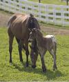
| 05/11/2004 10:39:08 AM |
Mother's Loveby shkelly587Comment: This definitely comes across as a springtime shot. The mix of white fence, green grass, and tan horses compliment each other well. The detail and exposure of the horses are good. The composition is good, although I'd be tempted to try a different crop - a little off the right side to get rid of the black pole and the top until the gap above the fence is gone, and the faded line at the bottom - which I think would center in on the horses more. |
| Photographer found comment helpful. |
Home -
Challenges -
Community -
League -
Photos -
Cameras -
Lenses -
Learn -
Help -
Terms of Use -
Privacy -
Top ^
DPChallenge, and website content and design, Copyright © 2001-2025 Challenging Technologies, LLC.
All digital photo copyrights belong to the photographers and may not be used without permission.
Current Server Time: 08/09/2025 04:34:43 PM EDT.