| Image |
Comment |
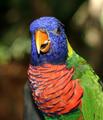
| 10/05/2004 12:04:52 PM |
Color wildby PepetteComment: A very vivid and bright image. Wonderful colors with good detail in the feathers. Considering the entire bird isnt in the shot a tighter crop may have worked better. The background looks nicely blurred but the beak and the shoulder are also a little OOF so just shifting the focus a tad or closing down the aperature a little more would have gotten more of the bird in focus. A very cheerful shot. |
 Photographer found comment helpful. Photographer found comment helpful. |
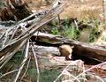
| 10/05/2004 11:59:42 AM |
"Waiting for Mum to return" A Red Fox Cubby NodeComment: Your subject is fairly small and is a little lost in all the clutter of the rest of the image. I understand having the environment in the shot as well to establish location but this image seems a little too much environment and very little animal. If you cant get physically closer or your lens just doesnt reach then cropping the image can also work. Using just the lower third block of the image - cropping down to the intersection of the two diagonals (hollow tree and the branches) and everything else to the right of that would isolate the cub more, still show environment, have a strong diagonal to lead the eye through the shot, be less cluttered, and depending on the size your camera shoots the image you could still get a good 640 crop and have it almost zoomed in to see the detail of the fur and such a cute face. |
| Photographer found comment helpful. |
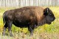
| 10/04/2004 01:46:47 PM |
Female Bison in the Wildby artvetComment: I like what looks like aspens in the background, they add a nice background and good color that continues with the grass. The exposure is good and you can see the wonderful textures of the fur. The composition of filling the frame with the bison is good but the pose itself is rather static. It works as a profile shot showing off the frame of the bison but it just lacks some interest. It's quite hard, especially in the wild, to find different or unusual poses of well-photographed animals. |
| Photographer found comment helpful. |
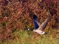
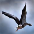
| 10/04/2004 01:34:06 PM |
Soloby scrum8Comment: The background seems a little too busy or contrasty and so the bird blends a little. It does have a somewhat 3d feel to it after you look at it for a while but I have to say I would have preferred a different background. The focus on the goose is good, especially considering he's flying. It also looks fairly sharp. His wings look a little blue, which is quite unusual looking. |
| Photographer found comment helpful. |
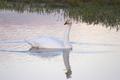
| 10/04/2004 01:30:14 PM |
Life as a Swanby andrimComment: I like the reflection and the ripple in the water. The tones are interesting, almost pastel except for the reeds/weeds/grass. The orange/yellow and black of the beak stands out nicely compared to the white of the swan. Exposure looks ok too. |
| Photographer found comment helpful. |
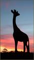
| 10/04/2004 01:26:48 PM |
Giraffe at sunsetby trainComment: An interesting image. The sunset colors are good and I like the graduation of tones. The placement of the horizon is good too, as is the placement of the giraffe in the frame also. The tree does a good job of balancing the image. I keep looking at the legs because they look so weird. It looks like one leg with a hole in the middle. It's interesting how the mind fills in the blanks. It's nicely sharp, although a tad oversharpened with the white halo standing out more against the black silhouette. |
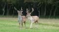
| 10/04/2004 11:56:19 AM |
Oh Dear Me!by BrookiedComment: The image seems a little static with the center placement of the deer. Shifting them to the left a little could make it a little more dynamic and the direction the deer is viewing would help to lead the eye out of the frame. I like the even lighting and the dark wood behind has an almost spooky feel to it. The image is also a little soft. |
| Photographer found comment helpful. |
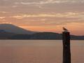
| 10/04/2004 11:50:30 AM |
Resting at Sunriseby Luca66Comment: The composition with the bird on the right is good, although I would likely crop half of the sky out to make the image more dynamic. As is the negative space above the bird is making it appear small and lost within such a large area. By cropping some of the top the bird appears larger in the frame. The colors look a little wishy washy and could probably do with a slight saturation boost. I like the leading line of the post to bird and then out of the frame along the mountain range. |
| Photographer found comment helpful. |
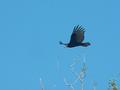
| 10/04/2004 11:45:29 AM |
Turkey Vultureby GraciousComment: You've managed to capture an interesting bird in what appears to be the wild. Unfortunately the quality of the image isnt the best. The bird itself seems to have two tones, almost like you tried to recover details in the shadows (the tail feathers) and it just lightened them up unnaturally. The bird is quite a distance away and so there are hardly any details to be seen and it looks quite soft. Although having the foliage in there gives a sense of location they are mostly blurry and seem more like a distraction. |
| Photographer found comment helpful. |
| 10/04/2004 09:48:18 AM |
Go Southby jonrComment: Wonderful focus! These guys are so difficult to get while flying and you've captured a very nicely exposed, sharp, and unusual shot. The color is great and the dark grey feel is very atmospheric and dramatic. Excellent details in the feathers and even in the highlights/shadows. The angle of the shot and the crop has made the wings the focus point and they do an excellent job at that. Impressive shot! |
| Photographer found comment helpful. |
Home -
Challenges -
Community -
League -
Photos -
Cameras -
Lenses -
Learn -
Help -
Terms of Use -
Privacy -
Top ^
DPChallenge, and website content and design, Copyright © 2001-2025 Challenging Technologies, LLC.
All digital photo copyrights belong to the photographers and may not be used without permission.
Current Server Time: 08/07/2025 06:47:20 AM EDT.