| Image |
Comment |
| 03/29/2006 04:19:41 PM |
Like an Icebergby GlouComment: I like this - it is very light and ethereal in its abstractness. The bubbles at the bottom almost remind me of braille lettering for some reason. |
| 03/29/2006 04:18:07 PM |
Refreshing!by neenee1999Comment: The colors and lighting look a little dull on my monitor, perhaps a level or curves adjustment could bring them up a little more. I also find the water drops on the glass fairly distracting since they dont really add anything to the composition. |
 Photographer found comment helpful. Photographer found comment helpful. |
| 03/29/2006 04:16:08 PM |
Without Water There Would Be No Bridgesby TJ23Comment: It's likely just the perspective of the bridge but it makes the image look unstraight - I feel my head tilting to straighten up the line of the bridge. Of course straightening up the bridge makes the horizon uneven so I think maybe a different angle of the bridge may have been better. |
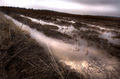
| 03/29/2006 04:13:31 PM |
Trailsby LouisComment: The tilt angle/perspective works on some images but I dont think it really works here, although I can see why you maybe did it to get the diagonal lines running through it. The dodge/burn (or similar) also seems to be slightly overdone, especially in the sky since there is an overexposed streak that runs through it. The subject is fairly unappealing to me and I feel like it needs another something to make it more interesting. |
| Photographer found comment helpful. |
| 03/29/2006 04:08:27 PM |
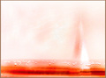
Lighting Up The Darknessby KitaComment: The image itself isnt bad but the composition seems to follow the basic stance of put everything in the middle. Because of that I am going to assume you're a beginner. The rule of thirds isnt a hard fast rule but for most situations it dramatically improves the composition, and I think this situation would benefit from it. The horizon line is almost exactly in the middle, effectively cutting the image in half. If you split the image into thirds and put the horizon on either the lower or upper third it would help. In this case since the water has more detail than the sky putting the horizon on the upper third would be better. Similiarly splitting the image vertically into thirds and putting the line created by the sun on the third it would make the image more appealing to the eye. |
| Photographer found comment helpful. |
| 03/29/2006 11:44:28 AM |
|
| Photographer found comment helpful. |
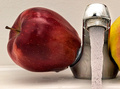
| 03/29/2006 11:43:35 AM |
The red oneby Robot-FotomatComment: Very original concept and I like the composition. The lighting and visual appeal is lacking, however, and is what lets the image down. This type of image is more appealing when it's brighter, more colorful, and 'cleaner'. The water droplets on the counter, the dullness to the chrome, and the 'corosion' to the spout makes it more 'real' but less appealing. |
| Photographer found comment helpful. |
| 03/29/2006 11:39:02 AM |
Lost Streamby goldenhawkofkyComment: I like the monochromatic tone of the image. It seems very peaceful and tranquil. A very soft flowing photograph. |
| Photographer found comment helpful. |
| 03/29/2006 11:37:33 AM |
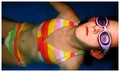
trioby RikkiComment: Very bright and colorful, although could have done with being a little more sharper. Not so sure about the thick white line around the bigger droplet either. |
| Photographer found comment helpful. |
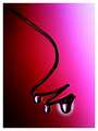
| 03/29/2006 11:30:39 AM |
It's water....manby stare_at_the_sunComment: I like the close-up and the stop-motion of the water is good. The lighting and tone could do with some work, though. I appreciate and understand the use of blue in the toning but it seems a little flat. Something more subtle may have worked better, such as adding some blue to the neutrals/whites or adjusting the blue in curves. With this type of close-up a lot of the emphasis is on the eyes and the eyes here look a little dark, esp the one on the right with no catchlight at all. |
| Photographer found comment helpful. |
Home -
Challenges -
Community -
League -
Photos -
Cameras -
Lenses -
Learn -
Help -
Terms of Use -
Privacy -
Top ^
DPChallenge, and website content and design, Copyright © 2001-2025 Challenging Technologies, LLC.
All digital photo copyrights belong to the photographers and may not be used without permission.
Current Server Time: 07/31/2025 05:31:40 PM EDT.