| Image |
Comment |
| 03/02/2003 11:05:00 PM |
|
 Photographer found comment helpful. Photographer found comment helpful. |
| 03/01/2003 10:22:34 AM |
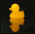
Two little ducks?by moodvilleComment: After comments in the forum about this challenge I went and calibrated my monitor. To my despair, what I thought was solid dark black in this photo turned out to be lighter and smudgy. I am simply amazed at my score with my new found knowledge, but thank everyone that voted and commented. |
| 02/24/2003 09:42:16 PM |
|
| 02/24/2003 09:41:12 PM |
|
| 02/24/2003 09:24:27 PM |
Not A Happy Pictureby DrJOnesComment: This image is very shocking and quite disturbing. The crop is good, the red against the white/black/gray is a sharp contrast. I dont 'like' the image, but it certainlly expresses emotion and adequately meets the despair challenge. |
| Photographer found comment helpful. |
| 02/24/2003 09:19:45 PM |
Whiteby j4y4Comment: The crop/composition is good, as is the lighting. However, the flower doesnt appear to be visibly dying, and I dont really see any despair in the image. |
| 02/24/2003 09:17:47 PM |
more?by Pep VentosaComment: The coloring is effective, the angle very good. The image is very expressive and quite thought-provoking. I liked it. |
| Photographer found comment helpful. |
| 02/24/2003 09:14:38 PM |
Sullenby RiderGalComment: Interesting perspective. I like the colors and the dof, and the composition/crop is good. |
| Photographer found comment helpful. |
| 02/24/2003 09:01:23 PM |
Set Me Freeby NatashaComment: That's a very sad-looking eye! The crop is good, the choice of B&W works well, and it speaks volumes. |
| Photographer found comment helpful. |
| 02/24/2003 08:59:49 PM |
"This Made Me Cry...."by sfarrell23Comment: I feel like the crop is a little too tight at the bottom and too much at the top, although I'm thinking there may be reasons for not showing the details on the stone. The image is certainly expressive and fills one with sadness. |
| Photographer found comment helpful. |
Home -
Challenges -
Community -
League -
Photos -
Cameras -
Lenses -
Learn -
Help -
Terms of Use -
Privacy -
Top ^
DPChallenge, and website content and design, Copyright © 2001-2025 Challenging Technologies, LLC.
All digital photo copyrights belong to the photographers and may not be used without permission.
Current Server Time: 07/31/2025 06:11:37 PM EDT.