| Image |
Comment |
| 06/11/2003 01:48:08 PM |
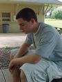
Model Of The Month (Cosmo)by AmieeComment: The image quality doesnt appear to be that good, quite possible because of the resolution of your camera - there is some fuzziness to the image. It looks like you may have taken the shot under a tree or some cover and I think that caused the darker image which in made it more difficult for your camera to focus well. The roof of the building in the background is a little distracting and would probably be better had there been more of it or cropped out completely. The pose he is in suggests reflection and some broodiness, and I think given better lightning this could have been a dramatic shot. |
| 06/11/2003 01:44:06 PM |
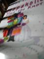
Shopaholicby URBANREMIXdotCOMComment: The image is very small and the photograph itself is very blurry. It looks almost like a photograph of a book. It doesnt look to be straight and so the background can be seen on the top left and it's a little distracting. There also appears to be shadows across the image. I'm assuming you have a lower-end camera, and some things you could do to improve an image like this would be to use more natural light in order to help your camera focus more and thus get a more clearer image. It could also be that you held or had the book too close to the camera and the macro capabilities of your camera wasnt able to focus so close. |
| 06/11/2003 01:39:22 PM |
|
 Photographer found comment helpful. Photographer found comment helpful. |
| 06/11/2003 01:35:55 PM |
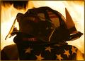
Firehouse Magazineby DiversqComment: There is certainly a great mood from this, a varied range of emotions. The image itself is good, powerful, and dramatic. It's certainly something I'd expect to see on a magazine cover. The flames in the background are really effective, certainly adding to the drama. The helmet is a little dark, I'd probably like it a little lighter, but it's more sombre dark. The flame on the right is a little distracting, but it also causes me to wonder how the image was taken. A ring of fire around the helmet in the center? The flames seem to be high and scary so I hope the owner of the helmet was around to aid you with them after the shots were taken. Great image! |
| Photographer found comment helpful. |
| 06/11/2003 01:29:34 PM |
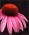
Garden Designby DennisFComment: Hrm, a flower picture (just kidding!) I really like this, it has great color and nicely sharp. The plain black background compliments it well and works as a format for a magazine. The tonal range of the petals is wonderful. The farthest right petal is a little soft, but it's only really noticable because my eye seemed to get drawn to it moreso than the others. It's something I would expect to see on the front cover of a gardening magazine. Well done |
| Photographer found comment helpful. |
| 06/11/2003 01:18:41 PM |
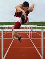
Runners worldby kengurinnComment: Great capture! The sports action and closeness of this shot is amazing. If he had been looking toward the camera with a neat expression it would have been even better, but you have to work with what you are given in these situations. I could easily see this on the front of the magazine. The only negative is that the colors look a little dull and flat, but looking at the sky it would seem you had a cold, dull day to shoot. Again, you have to work with what you got and what you got is pretty good! |
| Photographer found comment helpful. |
| 06/11/2003 01:14:39 PM |
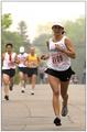
Runner's Worldby ToddhComment: Great image! The expression on her face is good and the stop action is clean but obviously you can see the motion without needing any blur. The composition is great with an appropriate dof. I'm sure I would be encourged to read the accompanying article. It seems the sky wasnt working for you, but as a magazine cover it makes a great place to put the title so wouldnt be detrimental to the image at all. |
| Photographer found comment helpful. |
| 06/11/2003 01:08:29 PM |
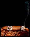
Cigar Aficionadoby crabappl3Comment: Simple and classy. I have no idea if that's a good brand of cigar or not, but it's something I'm sure would appear on your chosen magazine. I think the cigar is on some bark or maybe it's the leaves or something, but whatever it is I like the texture and color, very complimentary to the cigar. The trail of smoke leads upwards to where I assume the title would be. Great image! |
| Photographer found comment helpful. |
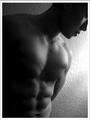
| 06/11/2003 01:04:20 PM |
Male Fitnessby imagesloyolaComment: Yum! The shadows really enhance the six-pack and the choice of black and white helps with the mood. Having the face not be the main focus works, especially as the magazine is promoting health and fitness. There is enough space around the image for the magainze blurbs and I could really see this on the front cover on Men's Fitness. The only negative is the over exposed area to the side of his shoulder. |
| Photographer found comment helpful. |
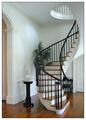
| 06/11/2003 01:00:36 PM |
Home and Design by sherComment: Oh how I wish my house looked like this! First impressions are that it's a clean image (and clean staircase), and very classy-looking. The curve of the staircase is appealing to the eye and something that isnt common and so it gives a sense of interest. It would certainly be a cover I'd expect to see on Home and Design and it would encourage me to read the accompanying article. The only negative is something petty, but I find the whiteness of the border makes the white in the photograph to appear somewhat duller, which is a shame because otherwise the feel is a bright, airy room. |
| Photographer found comment helpful. |
Home -
Challenges -
Community -
League -
Photos -
Cameras -
Lenses -
Learn -
Help -
Terms of Use -
Privacy -
Top ^
DPChallenge, and website content and design, Copyright © 2001-2025 Challenging Technologies, LLC.
All digital photo copyrights belong to the photographers and may not be used without permission.
Current Server Time: 08/01/2025 02:25:28 PM EDT.