|
|
|
Showing 141 - 150 of ~172 |
| Image |
Comment |
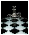
| 01/14/2003 12:49:16 PM | I'm Still Standing.......by agwrightComment: When I critique my students work I seldom give 10's. I feel perfection is almost impossible to achieve. Yet every once in awhile a photograph comes along that I feel is worthy of that elusive 10. Your work falls into that catagory. The lighting, contrast, elements of design, (perspective, point of view, shape and form, pattern, texture, and reflection), all add up to an outstanding photograph. Plus you met the challenge. But, being the person I am, I always try to see if I could make the picture better. I don't know if this is a good or bad fault. I would like you to try something...Instead of having the king centered squarely on the queen and at a 90 degree angle, could you possibly turn the king slightly towards the viewer and move it off center a little. I feel this would give it a more 3D effect. Non the less, a quality photograph and it should have been rated much higher than the 6.02 you received. (9.5) Sorry, I couldn't help myself |  Photographer found comment helpful. Photographer found comment helpful. |
| 01/14/2003 12:31:27 PM | Whos of Whovilleby CreativeFlyPhotoComment: Critquing is so subjective and depends on the viewers tastes. Personnally, I did not care much for the content of the photo but the photo itself had several good qualities. Your Point of View (shooting up) makes for a much more interesting photo than if you shot it straight on. I wish more photographers would try and use this Element of Design in their work. You also chose doing a close up, allowing for a lot of detail to be seen, very good. Cropping, if any, is very good. The boy's head is what we first look at and then the leading lines of his right arm brings us down to the image of the second person. The feather in his hat leads our eyes over to the boys left arm and once again we are back up to his face. This trianglular effect keeps the viewers eye continually moving around the picture. If you are aware that this is important you try and compose all your pictures in this fashion so you can keep the viewers attention as long as possible. The lighting could have been better, I would suggest using fill flash even when your outdoors. You will notice the contrast on the boy's face is very harsh. Fill flash would have balanced that out making for a much better image. Keep up the good work,JG | | Photographer found comment helpful. |
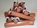
| 01/13/2003 05:17:17 PM | Who let the dogs out? Who?by justineComment: Excellent, excellent, excellent...You hit the challenge right on the head. So many people depended on their title to make their picture. Your subject matter, lighting, depth of field, and those glaring eyes. all work to make this my favorite. Your title just adds the mustard (pun intended) to a great entry. (10).JG | | Photographer found comment helpful. |
| 01/13/2003 04:32:34 PM | Someone Pass the Tagametby TurbotechComment: This is a very difficult picture for me to critique because the subject matter does nothing for me. Putting that aside, I will try and critique the picture based on its merit.You did a good job with the lighting, few glare spots and yet it was bright enough to use a high aperture setting allowing you to have a great depth of field. The balance of color is very good and I especially like the flower pattern of the back wall repeated in the spoon. The different shapes and forms work well together and you have several depths of field that also helps the picture. What bothers me most about the picture is everything is in straight rows, making the picture look flat and forcing my eye to run off the page. You have a lot of good things going with your picture, it's a shame we can't please every body every time. JG | | Photographer found comment helpful. |
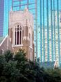
| 01/13/2003 04:16:57 PM | Stranger In A Strange Landby goodtempoComment: Great picture! There are so many elements of design encorporated in the picture you could hardly go wrong. (Reflection, pattern, shape and form, texture, point of view, perspective and shadow.) The use of F22 gave your picture a great depth of field which is so important when doing scenery. The only negative I see is the loss of some of the detail in the old church. This was caused by your light meter reading the sky or bright building instead of the church. This could be corrected in a couple of ways. The first is to lock your readings in place by aiming at the church and depressing the shutter slightly then without letting up on the shutter release compose your picture and finish the shot. The second way is to bracket your picture. Unless your camera has the capability to change into manual mode this would not be possible. If you would like to know more about bracketing, email me and I'll explain in greater detail. (9) JG | | Photographer found comment helpful. |
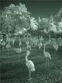
| 01/13/2003 03:40:59 PM | Toto I don't think we are in Kansas...by ambakerComment: I like the composition of the picture especially the great depth of field, where you have the birds in the foreground, the water in the middleground and the trees in the background. Using a F16/F22 allows everything to stay in focus. In this kind of picture that is necessary.The different textures work nicely for you also.The lighting, although effective in some areas, would have created a greater effect if you could have captured more of the birds in the light. They're long legs would have casted great shadows. Because many of the birds are in the shadows you cannot see a lot of detail in their faces. A 9 for composition, an 8 for texture and a 7 for use of light. Overall and 8. JG | | Photographer found comment helpful. |
| 01/13/2003 10:12:55 AM | |
| 01/13/2003 10:06:51 AM | Un-Forbidden Fruit by autoolComment: I was ready to jump all over this one until I put my glasses on. This is one of the few pictures that made me smile, most depended on the title to make it work...Great job! 9 | | Photographer found comment helpful. |
| 01/08/2003 10:17:57 AM | Digital Worldby arnitComment: great idea, I'm still debating whether I like the shallow depth of field or not, am looking forward to seeing what you have to say about your work. |
| 01/08/2003 10:10:29 AM | An Imposter!by smellyfish1002Comment: definitely a stranger, but not a strange in a strange land, cudos on the lighting, shape and form, shadow, and pattern which are all elements of design that make for a quality picture. |
|
Showing 141 - 150 of ~172 |
Home -
Challenges -
Community -
League -
Photos -
Cameras -
Lenses -
Learn -
Help -
Terms of Use -
Privacy -
Top ^
DPChallenge, and website content and design, Copyright © 2001-2025 Challenging Technologies, LLC.
All digital photo copyrights belong to the photographers and may not be used without permission.
Current Server Time: 08/06/2025 02:39:59 AM EDT.
|