| Image |
Comment |
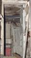
| 01/29/2003 10:57:05 AM |
Once Upon A Timeby mariomelComment: Nice image and I like the way the light shines throught the doors. However, the image is too dark to see all the details. If you were to go up to the wall and take your reading, (pressing down slightly on your shutter release) continue to hold down the release until you get back to were you want to take the shot. then shot the picture. Your camera will read what light it takes to get the wall and not the sky. This will give you a very satisfying photograph. I hope this helped. John |
| 01/29/2003 10:52:39 AM |
Abandonedby RiderGalComment: NIce depth of field picture, a little out of focus in the front of the picture, that's is the cameras fault not yours. The biggest problem happened when you tilted your camera to the side to get a vertical picture it put your flash to the side. This cause all your shaddows to be to the right of the images. If have a detachable flash and an extion cord that connects to the camera you can hand hold the flash above the camera and all your shadows will be behind the image. There are also grips you can buy that can attach to your camera that holds the flash. The parts that holds the flash swivals to always have the flash on top. I hope this helps. John |
 Photographer found comment helpful. Photographer found comment helpful. |
| 01/24/2003 07:07:32 PM |
Snowing in Baltimoreby bawlmeroryulsComment: The image and composition is high quality. Usually I don't like a strong image such as this pole directly in the center but in this pic it works. This is personal, but I don't care for the magenta tone. Perhaps a black and white? It's hard to tell without seeing it. Overall a (7) JG |
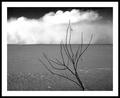
| 01/24/2003 07:01:13 PM |
Desertby JackoComment: Jacko, I love the simplicity of the moment and the strong contrast of images. The contrast of foreground and sky also elevates this work in my opinion. The only negative is the base of the tree right on the edge of the picture. It follows the same guidelines of never having a persons feet or head touching an edge. Drop the ground down an 1/8th of an inch and you have a 10. JG |
| Photographer found comment helpful. |
| 01/24/2003 06:52:28 PM |
at sunriseby BeeGeeComment: The view is dynamic and the rising sun allows you to see a little of what is going on. The bridge, boats and waves make for a nice point of view. I feel there is too much darkness for this pic. to be completely successful. But a nice shot overall. |
| Photographer found comment helpful. |
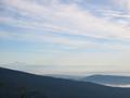
| 01/24/2003 06:47:12 PM |
Mount Bakerby lamentComment: The softness of the mountains and the variations on the blues make for a very appealing photograph. The tree at the bottom is the start of something that would appeal to me...However, you choose for more sky??? I feel if you would have cropped at least a 1/3rd of the sky and made it look more like a panorama the whole image would have come across more dynamic.JGill |
| 01/22/2003 07:29:20 PM |
The Lake is Ours Todayby ChrisW123Comment: I like the idea of adding a point of interest in a photograph to enhance the landscape. In the case of this photo, the Point of Interest dominates the photo and distracts from the challenge. Poor lighting on the mountains and trees didn't help the situation. J.Gill |
| 01/22/2003 07:18:53 PM |
Oak Treeby GotchaComment: I just reviewed the comments made be other members...and I agree whole heartedly that this is one of the best landscapes. I have critiqued thousands of photographs over the years and your work meets all the criteria for a great picture. You put the emphasis on the tree and placing it in the left 1/3 of the picture. Had you placed it anywhere else the picture would not have worked. By keeping the amount of ground to a minimum the eye can concentrate on the tree. The simplicity of the sky does not distract the viewers eye all these things add up to a great composition and photo. Anyone can take a picture of beautiful scenery if it surrounds them, as many did. But you took a not so beautiful site and turned it into a maginificent work of art. Great job. JG |
| Photographer found comment helpful. |
| 01/19/2003 06:52:47 PM |
It's In His Kissby RuchartComment: Like the point of view of shooting down and the way you framed the images. The lighting is fairly good except for the excess light that is hitting the boys ear. The boy is a little out of focus, the mother is in great focus. Overall a solid effort for your first piece. JG |
| Photographer found comment helpful. |
| 01/18/2003 05:25:59 PM |
Bluesy Revolutionby RavenComment: What a precious little girl... The lighting on your subject is very good. The point of view of shooting down creats a more creative image and the background makes for a nice contrast. It is the background, however, that also distracts my eye. Using a F2 or F2.8 would cause the back ground to blur a little allowing you to focus completely on your main subject. I have a general rule, any time you want your viewer to concentrate on one image in your picture blur the background if possible. Good Luck! JG |
Home -
Challenges -
Community -
League -
Photos -
Cameras -
Lenses -
Learn -
Help -
Terms of Use -
Privacy -
Top ^
DPChallenge, and website content and design, Copyright © 2001-2025 Challenging Technologies, LLC.
All digital photo copyrights belong to the photographers and may not be used without permission.
Current Server Time: 08/06/2025 12:47:00 AM EDT.