|
|
|
Showing 3001 - 3010 of ~3441 |
| Image |
Comment |
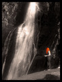
| 01/30/2006 12:35:39 PM | Red is the colourby BethraComment: I love this image as a whole... very good composition, nice exposure... but the red, I dunno, it's a bit too much. perhaps if your subject was complelel colorized I'd like it more, but just the red hair is somewhat distracting. |  Photographer found comment helpful. Photographer found comment helpful. |
| 01/30/2006 12:32:23 PM | |
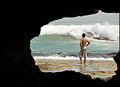
| 01/30/2006 12:31:18 PM | What's the surf like?by burtctComment: I like the framing here... wish it had just a bit more light inside the edges of the cavern, but overall nice image. | | Photographer found comment helpful. |
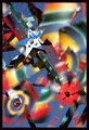
| 01/30/2006 01:55:12 AM | Arabian Flights by scalvertComment: Looking at your comments on how you did this... I must say VERY creative. Good job and well deserved ribbon! | | Photographer found comment helpful. |
| 01/28/2006 08:08:51 PM | Dapper Duoby yakatmeComment: ::: Greetings from Critique Club :::
Hi, as requested, here is an indepth critique of your submission.
First Impression - the most important one:
Wow, luck of the draw I get to discuss this photo with you again. It's quite a good shot and does meet the challenge well.
Composition:
I like how you framed your subject here, but the "frame" itself is a bit cluttered to be as effective as it could be.
Subject:
Subject is clear, but once again I'm distracted by all the clutter. By that, I mean I can tell too much of what is going on with everyone else. As mentioned in the forumns the pont of view is from inside the mob. A more omnipetent point of view may have broguht "singled" him out more.
Technical (Colour, focus, and light):
Colour: quite nice... but for some reason, my eye is seeing his color as being different than the rest of the image. He seems more saturated than everything else. I'm not sure why.
Focus: Very sharp in his eyes, but fades a little too fast from there.
Light: Well lit, and very well exposed.
To grow its vote?:
Point of view, I believe or simplification of the frame. Your outtake that you showed us, I feel with its simplicity and interest would have score quite a bit better.
Summary:
It is a good photo, very good technicals. Just a few compostional adjustments could have made this really something really special.
Hope to see more from you soon,
Leroy | | Photographer found comment helpful. |
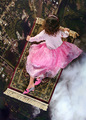
| 01/28/2006 03:51:16 PM | Jurassic Playby cloudsmeComment: ::: Greetings from Critique Club :::
Hi, as requested, here is an indepth critique of your submission.
First Impression - the most important one:
Indeed a nice fun, colorful portrait of the wonders of youth.
Composition:
Composition is good. Very well constructed.
Subject:
Crisp, clean, very well defined.
Technical (Colour, focus, and light):
Colour is wonderful, beautiful saturation.
Focus: You have super sharp focus on the child's eyes and just brings this photo to life.
Light in this photo brings out those wonderful colors. Nice indeed.
To grow its vote?:
While I have nothing but praise so far, this is where I'm going to have to give you a bit of negative feedback. This is a wonderful portrait, but it didn't fit the challenge. Voters were looking for candid shots in crowds, as suggested by the challenge description. Yes, you could say you singled this child out, but not in the context of what was expected.
Summary:
Overall, I love this image, but not in the context of this challenge. Had I voted on this challenge, it would have scored no higher than 5 or 6. Had I voted for it in a portrait challenge or "wonders of childhood" challenge, 8-9 (even 10) easily.
Hope to see more from you soon,
Leroy |
| 01/28/2006 03:17:15 PM | Karma On A Busy Streetby sajinComment: ::: Greetings from Critique Club :::
Hi, as requested, here is an indepth critique of your submission.
First Impression - the most important one:
Very crisp, very clean and fits my expectations of the challenge well.
Composition:
Maybe not the strongest compostion in the world, but certainly not the worst. I'd like to see a bit more of the background with your subject more off-center.
Subject:
Subject is strong and stands out quite well from the busy background.
Technical (Colour, focus, and light):
All of your technicals are dead-on. Focus is sharp, color is well saturated and natural, lighting is very good. Exposure is perfect.
To grow its vote?:
I'm afraid I'm not much help on growing a vote over 10th place. Perhaps, a bit stronger composition would help.
Summary:
Wonderful job on this challenge. You are well on your way to a ribbon.
Hope to see more from you soon,
Leroy | | Photographer found comment helpful. |
| 01/27/2006 08:04:04 PM | | | Photographer found comment helpful. |
| 01/27/2006 08:03:02 PM | | | Photographer found comment helpful. |
| 01/27/2006 07:58:44 PM | The Flyby photogenixComment: That is one hell of a macro lens ya got there. WoW! look at the detail. Awesome! | | Photographer found comment helpful. |
|
Showing 3001 - 3010 of ~3441 |
Home -
Challenges -
Community -
League -
Photos -
Cameras -
Lenses -
Learn -
Help -
Terms of Use -
Privacy -
Top ^
DPChallenge, and website content and design, Copyright © 2001-2025 Challenging Technologies, LLC.
All digital photo copyrights belong to the photographers and may not be used without permission.
Current Server Time: 06/23/2025 11:35:39 AM EDT.
|