|
|
|
Showing 2501 - 2510 of ~3441 |
| Image |
Comment |
| 04/29/2006 03:54:43 PM | Kaleidoscopeby moniepennyComment: ::: Greetings from Critique Club :::
Hi, as requested, here is an indepth critique of your submission.
First Impression - the most important one:
If I had such a lovely model standing in my mirror, I'd never use anyone else ;-)
Seriously, I thought it was a very good portrait. Loved the eyes. I only wish you had applied a bit more USM after resize.
Composition:
Works well. It's tight, but not so tight it makes me feel closterphobic. I think it is bold and "in-your-face". It deifinitely brings attention to your lovely eyes. (ok, I will "try" to quit flirting) :-)
Subject:
Usually, in a portrait, the subject is the person posing. I think you've gone as far as perhaps making your eyes the subject of the image. That's what I'm getting, anyway. The framing of the hair has really brought attention to them.
Technical (Color, focus, and light):
Color looks good to me. But may be just a little flat. Might want to be a bit more agressive with the curves.
Focus: A tiny bit soft, but perhaps just needed a bit more USM in post.DoF might have been just a bit too shallow also.
Lighting: Also, just a bit flat, but with the more agressive curve would have popped a bit more.
To grow its vote?:
A few technicals perhaps held you down. You beat me and portrait photography is what I do.
Summary:
[flirt on] Stunning, beautiful self-portrait. You can't pay for much prettier models. Those eyes kill me.[/flirt off]
I'm with Yanko and eschalar, this was highly under-rated. But, a few technicals could have popped you up a point or two. I think you did a great job, using a P&S.
[firt on]Here's to hoping we see more self-portraits from you :-) [/firt off again].
oh BTW:
Originally posted by moniepenny:
Edit: Well I didn't get it. Oh well. I'm wondering how the face is distorted though, I just don't see it...also I have a p&s, so wide angle isn't really a choice. |
I believe the "distortion" is a bit of misunderstanding of your uniquie PoV. Some might not like the "in-your-face" short focal length, close camera PoV.
Generally, portraits are shot with a less-wide zoom than you have used.
Hope to see more from you soon,
Leroy
Edit: for typos. Message edited by author 2006-04-29 16:00:43. |  Photographer found comment helpful. Photographer found comment helpful. |
| 04/29/2006 03:22:30 PM | Are you being served?by MajankaComment: ::: Greetings from Critique Club :::
Hi, as requested, here is an indepth critique of your submission.
First Impression - the most important one:
Loved it in the challenge, love it here. Thought it was creative and well executed with an interesting PoV.
Composition:
Works very well. Clean and appealing.
Subject:
Can miss it and the white bg couldn't go wrong.
Technical (Color, focus, and light):
All good. Materful techicals.
To grow its vote?:
Hell, you tell me :-)
Summary:
Good entry for this challenge. Keep up the good work.
Hope to see more from you soon,
Leroy | | Photographer found comment helpful. |
| 04/29/2006 02:28:17 PM | Jackson (20 months)by dugparkComment: ::: Greetings from Critique Club :::
Hi, as requested, here is an indepth critique of your submission.
First Impression - the most important one:
Nice portrait, but overall the image seems a bit soft.
Composition:
I like that you have left empty space on the right third of the image, pretty strong composition.
Subject:
Clear, and DoF works well for you.
Technical (Color, focus, and light):
Color: The color on this image works well, but it seems a bit flat. Might want to make a bit more aggresive curves adjustment.
Focus: This is what probably kept your score from being higher. I think it's from the DoF being a bit too shallow. Maybe should have stopped the lens down a bit more. Also, neat image (IMO) doesn't do well with portraits.
Light: I find your use of natural light very flattering in this image.
To grow its vote?:
I dunno, My guess is that the background didn't look studio enough.
Summary:
Great image, definitely a keeper. Maybe try some PS adjustments to sharpen it a bit more and try it w/o the NI.
Hope to see more from you soon,
Leroy |
| 04/29/2006 02:21:13 PM | Magic-1.jpgby tjmuellerComment: I like it, but the pose of the model is not flattering in the stomach area. | | Photographer found comment helpful. |
| 04/29/2006 02:20:13 PM | | | Photographer found comment helpful. |
| 04/29/2006 02:18:37 PM | Gym-2.jpgby tjmuellerComment: Whoa! That model is HOT! I'd like to maybe see a bit more USM on this image though. | | Photographer found comment helpful. |
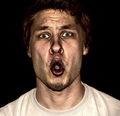
| 04/29/2006 02:02:10 PM | NOOOooooooby PainielComment: ::: Greetings from Critique Club :::
Hi, as requested, here is an indepth critique of your submission.
First Impression - the most important one:
To be quite honest --- LMFAO! :-) Very interesting.
Composition:
Crop here is making me feel a bit closterphobic. Otherwise, nothing wrong with it.
Subject:
Hilarious :-) Technicals is that it is starting to blend with the background around the hairline, so that needs a bit of bump up (probably some dodging would do it).
Technical (Color, focus, and light):
Color: I like the color treatment here, but it make have hurt you a bit in voting because of it's "un-saturated" look.
Focus: Sharp, 'nough said.
Light: Not sure if it's from the lighting or from the PP, but I find it interesting.
To grow its vote?:
I said this in another critique, but hot chicks and cute kids seemed to score well in this challenge and well hell you beat me, so ya did good :-)
Summary:
Funny, very funny. Thanks fo the laugh.
Hope to see more from you soon,
Leroy | | Photographer found comment helpful. |
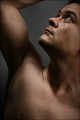
| 04/29/2006 01:47:22 PM | Light From Aboveby TUBORGComment: ::: Greetings from Critique Club :::
Hi, as requested, here is an indepth critique of your submission.
First Impression - the most important one:
Intersting shot. Definitely has a "studio" feel to it. Good use of light.
Composition:
It works and it works well. It's interesting and places points of interest in strong places.
Subject:
Hard to miss the subject. He (you) does stand out well from the background and composition brings my eye to your face.
Technical (Color, focus, and light):
Color and focus are both good.
Light: Lighting overall in this image is interesting with nice highlights and shadows. The one issue I have is the light fall-off on the background beneath the arm pit. You are losing the grey background that would help define the area more.
To grow its vote?:
Hot chick or cute child seems to work around here. :-) You did a fine entry in a tough challenge.
Summary:
Good work overall. Keep at it :-)
Hope to see more from you soon,
Leroy |
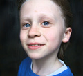
| 04/29/2006 01:40:19 PM | Silby messerschmittComment: ::: Greetings from Critique Club :::
Hi, as requested, here is an indepth critique of your submission.
First Impression - the most important one:
Nice "in-your-face" portrait of a cute young lady. The first thing that catches my eye are her blue eyes and the big square catch lights.
Composition:
I like the "in-your-face" feel of this image, but the crop is making me feel just a bit closterphobic. Back off just a hair in the crop and I feel your comp would be a little stronger.
Subject:
Sharp, in focus and stands out well from the background. Also, while it's not a classical portrait point of view, you have added interest to the subject by getting closer than usual.
Technical (Color, focus, and light):
Color: Good, I don't see much room for improvement here.
Focus: Sharp as a tack.
Light: Looking at the catch lights I see you have most likely used window light. It worked well for you. No unflattering shadows, yet the lighting doesn't come out too flat either.
To grow its vote?:
While I find the shot interesting and fresh, you possibly got some DNMC votes because of the background. It just doesn't look "studio" enough.
Summary:
What can I say, I think it's well done with "limited" resources. Keep up the good work.
Hope to see more from you soon,
Leroy | | Photographer found comment helpful. |
| 04/29/2006 01:31:17 PM | Introducing Samiby ClubJuggleComment: ::: Greetings from Critique Club :::
Hi, as requested, here is an indepth critique of your submission.
First Impression - the most important one:
Cute, very cute. But, with her being on someones' shoulder and a nicely out-of-focus, but unsolid background, seems more like a really good candid rather than a studio portrait to me.
Composition:
Composition is fine for a protrait, although crop may be just a bit too tight.
Subject:
Clear and in focus and DoF isolates her well from the background.
Technical (Color, focus, and light):
Color seems natural and well managed.
Focus is sharp and as I said earlier DoF works well for you.
Lighting and exposure are good, although the photo comes out a bit flat for me. A bit more radical curves adjustment could give this photo a bit more pop.
To grow its vote?:
Technically, all around it's a good photo. However, I (and I'm sure quite a few others) don't see it as meeting the challenge. But, she IS precious. Hell, she beat MY score :-)
Summary:
Lovely shot of your niece, a keeper for sure. As always, good work from you, Terry.
Hope to see more from you soon,
Leroy | | Photographer found comment helpful. |
|
Showing 2501 - 2510 of ~3441 |
Home -
Challenges -
Community -
League -
Photos -
Cameras -
Lenses -
Learn -
Help -
Terms of Use -
Privacy -
Top ^
DPChallenge, and website content and design, Copyright © 2001-2025 Challenging Technologies, LLC.
All digital photo copyrights belong to the photographers and may not be used without permission.
Current Server Time: 06/27/2025 10:45:45 AM EDT.
|