| Image |
Comment |
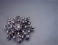
| 07/26/2006 01:52:31 PM |
SilverSnowFlakeby TheStickComment: I like the compostion and the negative space. I'm not sure why the image is so grainy though. It's hard for that subject to be compelling on it's own as an interesting subject of an image. |
 Photographer found comment helpful. Photographer found comment helpful. |
| 07/26/2006 01:50:22 PM |
Balloonedby janskuComment: I'm going to have to object to the post processing. The image looked as though it isn't very close to what came out of the camera. I do like the triangles that are created by the image contrasting with the circular baloon on the shadow. |
| Photographer found comment helpful. |
| 07/26/2006 01:48:57 PM |
Just For Youby JudiComment: Great light, great picture. The border works well too. Good job. |
| Photographer found comment helpful. |
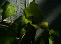
| 07/26/2006 01:47:47 PM |
Mr. Green Leavesby bobgaitherComment: The texture of the leaves is intersting, but to me, the image is too busy with the lack of a central object that the image is about. |
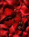
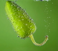
| 07/26/2006 01:42:35 PM |
Cherry Roseby heathenComment: I love the water on the pedals. It adds more texture and makes the whole image more interesting. What I'm not sure that I like is that the cherries are completely overpowered by the red of the pedals. I think that toning down the pedals a bit or finding brighter cherries may have helped the image. Overall though, I like it. |
| Photographer found comment helpful. |
| 07/26/2006 01:41:02 PM |
Red On Redby cliff_wrightComment: That's a great flower picture. Stem might have been a little less distracting if it were a bit more desaturated. As it is, the stem takes a little away from the texture of the flower and pedals by standing out as the only thing that isn't red (or close to it). |
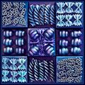
| 07/26/2006 01:41:01 PM |
Shades of Blueby sherpetComment: Interesting image. A little bit too overprocessed IMO. Either that or I'm not imaginative enough to figure out how you pulled this off. in any case, I love the symmetry of the image as well as the texture of the noodles. Good job! |
| Photographer found comment helpful. |
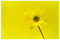
| 07/26/2006 01:37:42 PM |
Green by JulieGComment: I love it. The focus is right on, and it fits the challenge well. The only think I'm not that keen on in the composition. I'm a fan of negative space and I wonder what it would have looked like off center with some plain green in the image. |
| Photographer found comment helpful. |
| 07/17/2006 11:07:54 AM |
|
| Photographer found comment helpful. |
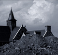
| 07/16/2006 12:15:33 PM |
burying the pastby dragonladyComment: Technical: Focus - 1
Exposure - 1
Quality - 1
Aesthetic: Comp. - 0
Light - 1
Color - 1
Wow factor: 0
Personal tilt: 1/3
What I liked: Creative thought.
What might improve the image, IMO: The composition of the image may benefit from being less centered as far as the horizon of the image is concerned
NOTE: I'm trying this system of giving comments on all images I vote on, my score of the photo, and what I did and did not like. Please, I'd like feedback on whether or not this is helpful, so feel free to give me a PM with any feedback - positive and negative are welcome. Also, my profile has more about what all of the terms in my grading system mean to me. |
| Photographer found comment helpful. |
Home -
Challenges -
Community -
League -
Photos -
Cameras -
Lenses -
Learn -
Help -
Terms of Use -
Privacy -
Top ^
DPChallenge, and website content and design, Copyright © 2001-2025 Challenging Technologies, LLC.
All digital photo copyrights belong to the photographers and may not be used without permission.
Current Server Time: 08/25/2025 03:05:42 PM EDT.