| Image |
Comment |
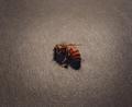
| 05/17/2004 04:56:41 AM |
The Sleeping Beeby s4nd3r99Comment: Though color is good, the dark shadow makes it hard to make out detail in your too small subject. |
 Photographer found comment helpful. Photographer found comment helpful. |
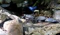
| 04/27/2004 11:33:34 AM |
Blending inby GrandmaEMTComment: Contrast range is set a bit too high as you have some blocking of shadows and hot spots in the highlights of the left. Meets the challenge well. |
| Photographer found comment helpful. |
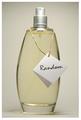
| 04/27/2004 11:29:31 AM |
Serendipity Essenceby anirenoComment: Marvelous tones and colors. Lighting is very good too as the glass is well defined and only one small hot spot at the top. Composition is a bit static as I think it could use a small accessory to be included in the image for interest and variety. |
| Photographer found comment helpful. |
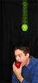
| 04/26/2004 01:40:43 PM |
Sir Isaac Newton Discovers Gravity...by bbmohrComment: Hilarious! Well done and the colors are really good too. Only thing I would say negatively is that the top of your subjects head appears to have gotten cut off. 8 |
| Photographer found comment helpful. |
| 04/26/2004 08:47:24 AM |
Surprise Cereal Prizeby JesuispeureComment: Very good challenge concept but your lighting is too harsh creating hot spots and shadows. Also, the box at the top is out of focus. It would have had more impact for me if you'd have had a few corn flakes falling out of the box at the moment of exposure. |
| Photographer found comment helpful. |
| 04/26/2004 08:38:39 AM |
|
| Photographer found comment helpful. |
| 04/26/2004 07:54:06 AM |
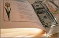
Between pagesby greslizzzComment: It's good you used B&W book to contrast with the colored bill, but I find the illustration in the book competes for attention with the bill. |
| 04/26/2004 07:41:30 AM |
In the Gardenby boyte1Comment: The scene has a lot of appeal and potential but is weakened by a blown out sky that detracts from your main subject and by a tilted horizon line. |
| 04/26/2004 07:36:28 AM |
"I Should Read More Often..."by sfarrell23Comment: The idea is a good one and meets the challenge well but I believe your lighting is not well controlled. For one thing, the dollar bills are dark from shadows from lighting that is not well positioned. Also, the lighting is creating back lighting on the pages on the left side showing through the back side of the pages. I may not have used a book with illustrations or pictures as this detracts from the impact of your subject, which is already weakened by poor lighting. Finally, cropping at the top seems constrained. |
| 04/26/2004 07:29:26 AM |
twice luckyby lakritstrollComment: I like the colors and grainy quality of the flower petals, as well as, the composition, which is really very good. For me, the weakest part of the picture is your subject, the two jewels, which seem under lit. They need a bit more pop from say a spot light, albeit hard to do with such small subjects. Actually, I think the whole image could use more light. Looks like your light source was natural light from a window? Good job, nonetheless. 8 |
| Photographer found comment helpful. |
Home -
Challenges -
Community -
League -
Photos -
Cameras -
Lenses -
Learn -
Help -
Terms of Use -
Privacy -
Top ^
DPChallenge, and website content and design, Copyright © 2001-2025 Challenging Technologies, LLC.
All digital photo copyrights belong to the photographers and may not be used without permission.
Current Server Time: 08/14/2025 10:32:57 AM EDT.