| Image |
Comment |
| 07/01/2004 02:23:22 PM |
Wondering...by bruskiComment: Absolutiely adorable! I wish your focus was a bit crisper though. The lighting is very good. |
 Photographer found comment helpful. Photographer found comment helpful. |
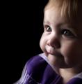
| 07/01/2004 02:20:08 PM |
Katby rubyrednailsComment: Looks like you've achieved the softness effect with a slight out of focus lens, but I think you would have been better off with a lens diffusing filter |
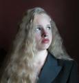
| 07/01/2004 02:12:45 PM |
Katherineby kncoughlinComment: Beautiful model and wonderful lighting, but I think you over did it with the noise reduction program. Were you doing that for the soft look? Still, I like this very much. |
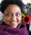
| 07/01/2004 02:09:41 PM |
Self-portrait With Flowersby carlacrypticComment: A nice vibrant smile to match the vibrant colors in this shot ! I would like to see the background flowers more blurred to create more seperation between the model and the background. Also, the image is a bit too busy. |
| Photographer found comment helpful. |
| 07/01/2004 02:03:22 PM |
I can hear musicby RUEDISCHMUTZComment: Contagious and cute smile and unorthodox pose make this a compelling photo for me. Could use a bit more detail in the shadows and a little more blur of the background too. |
| Photographer found comment helpful. |
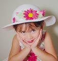
| 07/01/2004 01:59:01 AM |
My Little Angelby briphotoComment: And she is! Wonderful expression and pose of model, choice of hat and dress combined with high-key tonality very good. Lighting is too strong and I also don't like the shadow picture right (girl's left), which shows some noise. |
| Photographer found comment helpful. |
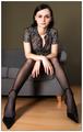
| 07/01/2004 01:48:00 AM |
Veroniqueby sahkoComment: I like the wide angle perspective as it distorts the scale of size of different parts of the model and couch. Well done. |
| Photographer found comment helpful. |
| 06/30/2004 12:50:04 PM |
Tessby sixmacsComment: I wish the background were a bit more blurred with a shallower DOF so as not to be so distracting. Also, the lamp pole seems to be coming out of your subjects head and I wish that it were parallel with the side of the frame, and not converging. Good lighting and color. |
| Photographer found comment helpful. |
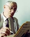
| 06/30/2004 12:22:16 PM |
The Journalistby ImagineerComment: Very good choice of subject matter and I like your angle of view getting a clear shot of his face and the newspaper, as well. I find the lighting to be too harsh and I wish the print on the newspaper was more blurred so as not to be distracting...in other words, get a shallower DOF. |
| Photographer found comment helpful. |
| 06/30/2004 12:18:45 PM |
Breakfast for Twoby OneSweetSinComment: I really like your choice of subject matter but find the exposure a bit too lacking in contrast. Also, I wish there were a contrasting background instead of the blown out white. |
Home -
Challenges -
Community -
League -
Photos -
Cameras -
Lenses -
Learn -
Help -
Terms of Use -
Privacy -
Top ^
DPChallenge, and website content and design, Copyright © 2001-2025 Challenging Technologies, LLC.
All digital photo copyrights belong to the photographers and may not be used without permission.
Current Server Time: 08/13/2025 02:01:28 PM EDT.