| Image |
Comment |
| 07/03/2004 09:41:06 AM |
Hostageby BeagleboyComment: Great lighting and very threatrical and I love the negative space, but not sure I would call this a portrait. Well done. |
 Photographer found comment helpful. Photographer found comment helpful. |
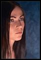
| 07/03/2004 09:24:54 AM |
Dreamerby NazgulComment: This portrait is excellent but I don't get the impression of your model being a dreamer from her somber and sad look. The lighting is really wonderful and skin tones and color are very good. Maybe a different pose (say with her head resting on her arms?) would express a dreamer to me. Technically very well done. |
| Photographer found comment helpful. |
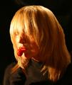
| 07/03/2004 09:18:57 AM |
Sheridanby gajmajComment: Absolutely beautiful high-key portrait! Lighting is excellent and I love her pose, smile and gaze. Color is good too, especially your model's hair, although skin tones may be a little washed out around her cheeks, but I think that is in the look you were going after. Very well done, and congratulations. |
| Photographer found comment helpful. |
| 07/03/2004 09:11:17 AM |
MyTootsieby neilmwilsonComment: Lighting is too harsh and concentrated in certain areas and missing in others, such as the side of her head and causing ugly shadows on her face. Especially concentrated on her bangs over her eyes causing a blown out area so that, along with her bangs, you can't see her eyes, which I think greatly detracts from the impact of this image. Had the lighting been implemented better I think I would have liked the colors a lot better too, which appear to be brown clothing contrasting with your model's beautiful red hair, lipstick and lollipop. I also think the lolli prop detracts from your model's provacative and sexy look and is confused with your model's apparent sophistication. Maybe an outstretched open palm as if blowing a kiss would have been better? Just my opinion and hope you don't take my comments negatively, as they were not meant to be. |
| Photographer found comment helpful. |
| 07/03/2004 08:47:52 AM |
Forty-Nineby charmayneComment: I would have preferred had you not cut off the back of her head. Skin tone appears a bit too orange. I do like the gaze and look of your model. |
| Photographer found comment helpful. |
| 07/03/2004 08:43:47 AM |
Kateby BobsterLobsterComment: Very interesting and unique looking portrait. I like your model's pose and gaze but I would prefer that she did not have a smile, but rather a more pensive and serious look. Skin tone/color appears too orange/magenta looking. Lighting is a bit too harsh and with the soft look you've acheived (with NeatImage?) to me the overall feel of the image seems to be somewhat confused . Gradient background is good. I also think I would prefer to see more detail in her hair, maybe with some fill lighting. |
| Photographer found comment helpful. |
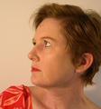
| 07/03/2004 08:30:08 AM |
sophisticatedby hopperComment: Lighting and skin tones are excellent. I think DOF is slightily too narrow and I don't particularly like her pose...too confrontative and seems to be showing off her rings. |
| Photographer found comment helpful. |
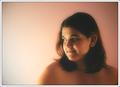
| 07/02/2004 12:33:30 PM |
Gizelleby MalokataComment: Good pose and expression and I find the soft effect and colors of this image to be quite artisitc. Atomosphere is good but I wish the skin tones looked more natural. |
| 07/01/2004 02:35:00 PM |
|
| 07/01/2004 02:32:15 PM |
Untitledby EddyGComment: Really great job of matching background to model's hair and skin coloring. Lighting is excellent and red dress gives some added life and a diversion from the other colors. |
| Photographer found comment helpful. |
Home -
Challenges -
Community -
League -
Photos -
Cameras -
Lenses -
Learn -
Help -
Terms of Use -
Privacy -
Top ^
DPChallenge, and website content and design, Copyright © 2001-2025 Challenging Technologies, LLC.
All digital photo copyrights belong to the photographers and may not be used without permission.
Current Server Time: 08/13/2025 07:03:13 PM EDT.