| Image |
Comment |
| 08/09/2004 10:12:39 AM |
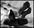
She's Out of Those Shoesby KevinRiggsComment: Composition is very good and I like the b&w, as well as, the grainy appearance. Gives the impression of a hard days work and on her feet for a long time I think that the lighting should be more on her feet and shoes, and less on her thighs. DOF is good and I like the way the shoes are blurred, but think it would have been better with more light on the feet and shoes. Also, would have preferred had the woman not been wearing stockings. |
 Photographer found comment helpful. Photographer found comment helpful. |
| 08/01/2004 08:24:38 AM |
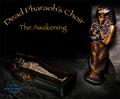
Dead Pharaoh's Choirby bongoComment: Blue and gold and maroon colors are really excellent set against the black. Very realistic looking cave scene and lighting is good too. I like your shooting angle but the image looks like figurines and not full size real caskets and mummy (not sure it's meant to look like the real thing though). Format could be more square. Very well done overall. |
| Photographer found comment helpful. |
| 08/01/2004 08:04:53 AM |
Deep Philosophical Commentatorsby johnmComment: Very well done technically. The composition is impeccable and I love how the lighting highlights the message. Color is phenomenal and the lettering font really fits well. The message, with it's almost hidden crosses give the image a dark and gothic feel and helps to convey that this band is about shedding light on the underside of life. A very well thought out and carried out image deserving of a very high score. |
| Photographer found comment helpful. |
| 08/01/2004 07:52:17 AM |
Desert Preservation Companyby BradComment: Wonderful detail in the desert sand and excellent deep DOF. Not sure I like the color of the sand by itself, but set against the pitch black sky it's really cool. The title seems more appropriate for an environmental organization that a music band. Overall, I like it. |
| Photographer found comment helpful. |
| 08/01/2004 12:53:25 AM |
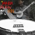
the Dakota Pickin' Clubby joebokComment: Really love the clarity and sharpness of the banjo set off against the blurred background. The colored font also breaks up the black and white of the image. The strong diagnal lines and font style really give the impression of some high energy picking. Only detraction is the blue left over in the background from incomplete desaturation? Wonder if the photographer is from SLC. Great job. |
| Photographer found comment helpful. |
| 08/01/2004 12:47:21 AM |
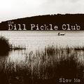
the Dill Pickle Clubby jjbeguinComment: Though the title is a bit of a stretch for me, the image is excellent and is a very good composition. I love the silhoetted grass and boat in the midground. The monotone really sets a mood. Excellent. |
| Photographer found comment helpful. |
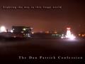
| 08/01/2004 12:43:44 AM |
the Dan Patrick Confessionby fstopopenComment: Format should have been more square. It's hard to tell exactly what I'm looking at, except that I know it's foggy. I would have preferred if you had isolated one of the structures instead giving the broad wide angle view. I do like the eerie lighting and color. |
| Photographer found comment helpful. |
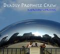
| 08/01/2004 12:40:08 AM |
Deadly Prophetz Crewby flip89Comment: Though I think you could have zoomed in a bit more on the band, I love the the backdrop of the urban setting on this chrome globe (?). It really adds realism. Title is a bit of a stretch for me, but won't hurt your score. Overall, I get the impression that this would make a good album cover. Good job! |
| Photographer found comment helpful. |
| 08/01/2004 12:36:06 AM |
Deranged Pregnant Chickby toddheadComment: lol...I can't stop laughing from this pic. Her possessed look is awesome and your angle of view really gives her a demonic power that is scary and funny at the same time. I think your lighting could have been better...maybe more directional and harsh lighting would have made it even scarier and I also would have not cut off her belly at the bottom to give her a more pregnant look. I like the makeup job, but think it could have been done better to more extreme and her hair a bit wilder. All in all though, I love the concept and think it's a great picture. Title font is good too. |
| Photographer found comment helpful. |
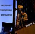
| 08/01/2004 12:28:01 AM |
Downright Phenomenal Cameramen- Shoot L.A.by moviemanComment: I like the way you've isolated the subject and his equipment against the dark background and your angle of view, but it also looks odd that the camera lens seems to be up against a pole. In addition, though it appears like you've shot this image late in the day or early in the morning, I think you shold have used your white balance in camera, or corrected the orange cast of your subjects as it looks odd. The title sounds more like a phrase than a name of a band. |
| Photographer found comment helpful. |
Home -
Challenges -
Community -
League -
Photos -
Cameras -
Lenses -
Learn -
Help -
Terms of Use -
Privacy -
Top ^
DPChallenge, and website content and design, Copyright © 2001-2025 Challenging Technologies, LLC.
All digital photo copyrights belong to the photographers and may not be used without permission.
Current Server Time: 08/10/2025 11:49:33 PM EDT.