| Image |
Comment |
| 10/15/2004 09:49:46 PM |
The Eyes: Je ne sais quoiby SweetlipsComment: Composition is good with the angle of her head and the way the hair sweeps but the color looks off and image is a bit on the soft side. Catchlights are too conspicuous, imo and attract a lot of attention. |
 Photographer found comment helpful. Photographer found comment helpful. |
| 10/15/2004 09:41:05 PM |
smileby whiteroomComment: Wonderful vibrant and compelling subject ! His smile and energy are infectious and make this image very compelling. You could just feel it looking at him. What happened to your background, though??? I think you used too much flash. Try a slow synch flash to get the background, next time. Well done! 8 |
| Photographer found comment helpful. |
| 10/15/2004 09:04:01 PM |
Rhythmby jmsetzlerComment: Equisite tones and fascinating subects really push this up to the top of my ribbons list. Focus is right on and this image is very compelling. Love the backlighting too. Very well done. 10 |
| 10/15/2004 08:56:41 PM |
Hip Hoppin Dancerby SonifoComment: Interesting, sassy and attractive subject. I really like the the reds your subect is wearing against the black & white striped background. It appears, though, that the image is underexposed on my monitor, anyway, causing the reds to be subdued. Would like to see more pop in this photo. Also, I find the foliage she's standing on to be unattractive and doesn't fit with the rest of the image. Despite these flaws, thie composition is good and I can see this picture being used in some advertising circular. 8 |
| Photographer found comment helpful. |
| 10/15/2004 08:50:01 PM |
His Gentle Eyesby annasenseComment: Good DOF and I like the capture alot, but think the eyes should be lighther with more detail showing. Background, though blurred, still has some distracting hot spots that pull your attention away from your subject. |
| Photographer found comment helpful. |
| 10/15/2004 08:45:48 PM |
EYES . . . . The Baby Blues Never Miss A Thing.by dartompkinsComment: Gorgeous subject and priceless gaze with beautiful color but I think the eyes should be lighter. Also, it looks as though you may have used a noise reduction program as there is very little detail in the skin. Still scoring this highly. Very well done, despite the minor flaws. 9 |
| Photographer found comment helpful. |
| 10/15/2004 08:35:34 PM |
Those Wide, Innocent Eyesby mocabelaComment: Funny look. Interesting subject, but it looks like you've cut his left arm off. Eyes have no catchlights to give him some spark and life and I think the lighting is a bit too harsh. If you're going to go with a high-key brightness and just black and white as the colors, I would hope that you would get more detail and better color in the skin. It appears a littel too blanched to me. |
| Photographer found comment helpful. |
| 10/15/2004 08:28:46 PM |
An Officer and a Gentlemanby drydocComment: Composition and concept here is excellent. Really like it but the image could use some improvement in other areas, such as, exposure (too dark) and it looks a little soft to me. Also, skin tones appear a bit too red to me. Other than those issues, which can easily be fixed, this is a great photo! Well done on the composition. 9 |
| Photographer found comment helpful. |
| 10/15/2004 08:12:01 PM |
|
| 10/14/2004 11:46:19 PM |
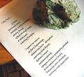
Way with wordsby lytaComment: I like the composition and grainy appearance a lot but certain improvements, I feel could give it more impact. First, what's your keyboard doing in there???!!! Secondly, I would like to see more even lighting and possibly some fill light on top to illuminate the rock and top of the paper better. Wish you had photographed this on some old antique desk or something. Also, the color grain could be eliminated with a noise reduction program like Neat Image and would like to see the luminance grain left Good idea, but needs improvement. |
| Photographer found comment helpful. |
Home -
Challenges -
Community -
League -
Photos -
Cameras -
Lenses -
Learn -
Help -
Terms of Use -
Privacy -
Top ^
DPChallenge, and website content and design, Copyright © 2001-2025 Challenging Technologies, LLC.
All digital photo copyrights belong to the photographers and may not be used without permission.
Current Server Time: 08/09/2025 04:51:22 AM EDT.