| Image |
Comment |
| 04/05/2007 12:52:50 PM |
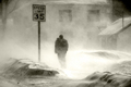
Late Winter Stormby Judith PolakoffComment: Great capture! Love it! The blown out highlights (was this intentional? my guess is not) and yellow toning really add to the dynamism and energy of this image, as does the flag and black sky. The speed limit sign adds a touch of irony in that it really refers to wind speed, and not to it's usual designation.
The person walking, however, appears too non-chalant for his surroundings and I think someone displaying a gesture of fighting the wind, bracing themselves or holding on to a hat would be more appropo and create greater impact. Finally, compositionally, I would prefer a less centered composition and think about about 1/2" could have been cropped off the left side.
Was this photographed through car or house window? Even with the faults I've mentioned above, I'm giving this a 10 and adding it to my favorites. Thank you! |
 Photographer found comment helpful. Photographer found comment helpful. |
| 04/05/2007 12:35:28 PM |
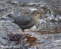
American Dipper_Water Ouzelby hahn23Comment: Shutter speed appears to be critical for this photo as too fast would render the water not as attractive as the smooth flow of this photo and too slow would render the bird not as sharp as you've captured. My only gripe would be more light to have fallen on the bird's body. Good job. |
| Photographer found comment helpful. |
| 04/04/2007 04:50:03 PM |
Casual Wearby islandpaddlerComment: Good pose, I like that it looks like he's holding up the lion statue. Torso appears too soft, maybe too much noise reduction? I also like the blurred background but feel the white shirt is out of place and borders on overexposure. Aspect ratio could have been a bit wider to include all of his right hand and knee. |
| 04/04/2007 04:30:52 PM |
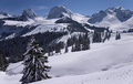
Winter sceneby RUEDISCHMUTZComment: It's a beautiful scene but a bit flat, imo. Contrast needs to be punched up a little, especially the snow, which appears too gray. Probably could have used another 2/3rds stop of light when exposing as the brightness of snow combined with angle of sun to camera caused some underexposure. |
| 04/04/2007 01:40:30 PM |
Barbie Girlby kloecktComment: Good rendition of skin tones to make your model appear plastic and I like her blank stare. However, is it me, or does it seem that her eyes and face are a bit soft compared with her clothes? Was that your intention? |
| Photographer found comment helpful. |
| 04/04/2007 12:30:25 PM |
Pinnaclesby BlackboxComment: I really like how the main subject stands out against the monotoned, silouetted background. Good job! |
| Photographer found comment helpful. |
| 04/01/2007 10:30:55 PM |
|
| Photographer found comment helpful. |
| 04/01/2007 10:29:19 PM |
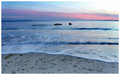
Evening Wavesby brimacComment: Looks oversharpened to me (halo around rocks), and not crazy about the artificial looking cyan color. Wish there was a subject to focus on as the distant rocks are too small to be of interest. |
| 04/01/2007 10:25:09 PM |
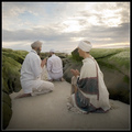
Meditationby TerramarComment: Perhaps if I could see the faces of your subjects I would feel a stronger spiritual connection. The blown out sky and drab lighting really detracts from this photo, imo. Poor job of cloing out the footprints in the sand and it appears you have some serious horizon tilt going on, but I could be wrong. Sorry to be so negative. |
| 04/01/2007 12:50:13 PM |
|
| Photographer found comment helpful. |
Home -
Challenges -
Community -
League -
Photos -
Cameras -
Lenses -
Learn -
Help -
Terms of Use -
Privacy -
Top ^
DPChallenge, and website content and design, Copyright © 2001-2025 Challenging Technologies, LLC.
All digital photo copyrights belong to the photographers and may not be used without permission.
Current Server Time: 08/08/2025 12:55:16 AM EDT.