| Image |
Comment |
| 02/08/2003 11:31:35 PM |
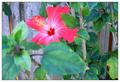
she loves me, she loves me not.by MajorChaosComment: The glass takes away from the effect...I think I more delicate looking and smaller vase would have been a lot nicer. I like the purple effect a lot and the way the lighting falls on the flower. |
 Photographer found comment helpful. Photographer found comment helpful. |
| 02/08/2003 11:21:58 PM |
|
| Photographer found comment helpful. |
| 02/08/2003 11:14:52 PM |
|
| Photographer found comment helpful. |
| 02/08/2003 11:10:23 PM |
Cute Pet Cliches ?by GordonComment: How adorable ! Just glad you got a nice thick border to keep him in the pic. Nice duotones too. |
| Photographer found comment helpful. |
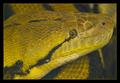
| 02/08/2003 11:01:20 PM |
Man's Best Friendby nfesselComment: I like the extremes of tones you've captrued here...it gives the picture a very nice effect. |
| 02/08/2003 10:49:38 PM |
meowby quicksand84Comment: Very nice composition. I like the format chosen and the pose of the cat. In addition, I like the texture of the cat oppsoing the texture of what ever's on top (window?). |
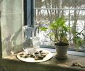
| 02/08/2003 10:46:48 PM |
Behind the clouds, the sun is shiningby SteveZComment: Great idea for a picture and well executed too. Minimal glare in the window. I just think the window sill is a bit stark and would have benefited from more plants or flowers in the vase. The backlighting from the window would have lit them up and would have given the shot more interesting color. |
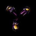
| 02/08/2003 10:39:57 PM |
Magenta Feelings in a Savage Gardenby Gracechild7Comment: I find the big green, and out of focus leaf in the front of the magenta flower to be very distracting. I would have prefered if it had been pulled out of the way or you had taken a different shooting angle to compose this picture otherwise. The lighting is too flat so that you can barely make out the stamen of the flower. If possible, a shooting angle that would have taken advantage of side lighting would have helped give a more 3D look. |
| Photographer found comment helpful. |
| 02/07/2003 01:02:26 AM |
|
| Photographer found comment helpful. |
| 02/07/2003 01:00:27 AM |
Horsin' Aroundby brumosComment: Nice composition, but I think you should have exposed for the shadows here...the main subject, the horse is too dark and has lost detail. |
Home -
Challenges -
Community -
League -
Photos -
Cameras -
Lenses -
Learn -
Help -
Terms of Use -
Privacy -
Top ^
DPChallenge, and website content and design, Copyright © 2001-2025 Challenging Technologies, LLC.
All digital photo copyrights belong to the photographers and may not be used without permission.
Current Server Time: 08/04/2025 10:42:12 AM EDT.