| Image |
Comment |
| 05/15/2003 02:08:09 AM |
|
| 05/15/2003 12:03:01 AM |
|
 Photographer found comment helpful. Photographer found comment helpful. |
| 05/14/2003 11:51:32 PM |
|
| Photographer found comment helpful. |
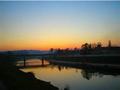
| 05/14/2003 06:58:44 PM |
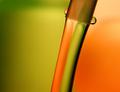
colorsby sselmanComment: I like the composition which kind of gives an impression of the canals in the Netherlands, but I find the exposure too dark, even though it appears to have been taken at dusk. Also, I believe it is too out of focus (could be from being so dark). |
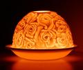
| 05/14/2003 11:03:09 AM |
Limogeby BarbComment: Nice shot, just think it needs to be tilted a degree or two to the right. Well done. |
| Photographer found comment helpful. |
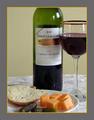
| 05/14/2003 10:58:47 AM |
Wine and Cheeseby orussellComment: I like the idea here, as well as, the colors, but I think the composition is lacking. I don't like that the wine bottle and glass, and plate at the bottom have been cut off. The food on the plate could have been arranged more aesthetically and maybe throwing in another prop, such as a vase and flower, or fruit would have worked better. |
| Photographer found comment helpful. |
| 05/14/2003 10:49:01 AM |
|
| Photographer found comment helpful. |
| 05/13/2003 10:37:11 PM |
Colored Glassby fredusComment: Not sure I like the angle of this shot. Also, the glass edges are not well defined. I think it would have looked better with a differnt background other than white. |
| 05/09/2003 12:43:17 PM |
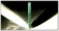
Shadow and Lightby K-RobComment: Very good abstract! It took me a minute to get this photo, but now that I did, I like it more and more. I like the way the diagnals of the lighting and shadows contrast with the upright standing glass. The green of the glass contrasting with the black/white is also nice. Well done. |
| Photographer found comment helpful. |
| 05/09/2003 12:19:20 PM |
Reunion Tower, Dallas Texasby goodtempoComment: This is a great picture, and though I think it says more "building" or "big business" than "glass" it still meets the challenge and I'm going to give it a high mark. I like the muted colors that suggest big business and your "slant" on the building's crop which reminds me of a business report with charts and graphs. Very good interpretation. Also, there is a quality to this photo that I would describe as "smaller than life"...It's as if the different geometric shpaes were block toys that could be rearranged. And even though the sky is uninteresting and too bright, I think it fits into this scheme so well lending to a very cohesive picture. WELL DONE! |
| Photographer found comment helpful. |
Home -
Challenges -
Community -
League -
Photos -
Cameras -
Lenses -
Learn -
Help -
Terms of Use -
Privacy -
Top ^
DPChallenge, and website content and design, Copyright © 2001-2025 Challenging Technologies, LLC.
All digital photo copyrights belong to the photographers and may not be used without permission.
Current Server Time: 08/05/2025 11:31:07 PM EDT.