| Image |
Comment |
| 06/18/2003 11:23:59 PM |
|
 Photographer found comment helpful. Photographer found comment helpful. |
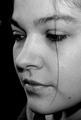
| 06/18/2003 02:46:21 PM |
Self -Portraitby chelseayankieComment: I like the soft focus and soft lighting as well, which bring out your features nicely. Cropping works well here too even with the top of your head cut off. I also like the negative space to the left, which helps to define your face. Pose is well chosen. You have big beautiful eyes and the shot is very captivating. Beautiful photo of a beautiful woman! |
| 06/18/2003 02:33:04 PM |
~Me~by HBunchComment: The bottom of the picture seems a bit strange to me cause it looks like your chin extends into your shoulder without much seperation. |
| Photographer found comment helpful. |
| 06/18/2003 02:27:59 PM |
Through the disco ballby lordrichComment: I would have preferred to see a shot of your head in the disco ball without the camera in it, and without all the other distracting things in the room, which just mar and confuse the picture. My eyes just jump around here without any rhyme or reason and there is nothing really all that interesting to look at. |
| Photographer found comment helpful. |
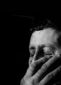
| 06/18/2003 02:23:58 PM |
light nights and hard daysby dasserComment: I like your composition and the wide contrast you've used. I feel indifferent about your pose and not sure if I like the hand covering a good part of your face. It looks like you're covering a sneeze. |
| Photographer found comment helpful. |
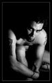
| 06/18/2003 02:12:42 PM |
Ink For Lifeby byetkoComment: Excellent dramatic lighting and I like your use of negative space here. I just think your pose does not show off your tatoos, which seems to be the subject of your title. Well done! |
| Photographer found comment helpful. |
| 06/18/2003 02:10:23 PM |
BodyScapeby photogooComment: I like the duotone and soft lighitng and focus too. The grainyness that you added is very effective. And the way you've devided the frame into thirds is very good too. |
| Photographer found comment helpful. |
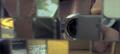
| 06/16/2003 12:39:03 PM |
PC-Worldby zeranicoComment: I find the item in the foreground too blown out and way too blurry so that it's very distracting. I think your photo would have been more effective if you had not used such a narrow DOF. |
| Photographer found comment helpful. |
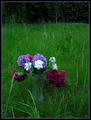
| 06/16/2003 12:27:52 PM |
Country Livingby MonaComment: Colors are very nice and came out very saturated, which I like, but I think the photo is underexposed, on the whole. Also, I think you could have cropped out the dark top 1/4th of the picture. |
| Photographer found comment helpful. |
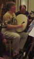
| 06/16/2003 12:17:34 PM |
Sing Out! ( http://www.singout.org/ )by eloiseComment: Underexposed and focus is too soft (possibly due to exposure?). Also, I find the guitar jutting out from the left into the woman's arm and chest to be distracting. |
| Photographer found comment helpful. |
Home -
Challenges -
Community -
League -
Photos -
Cameras -
Lenses -
Learn -
Help -
Terms of Use -
Privacy -
Top ^
DPChallenge, and website content and design, Copyright © 2001-2025 Challenging Technologies, LLC.
All digital photo copyrights belong to the photographers and may not be used without permission.
Current Server Time: 08/07/2025 08:10:10 PM EDT.