| Image |
Comment |
| 12/03/2003 11:55:11 PM |
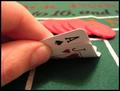
Blackjack pays 3 to 2by ZalComment: Very good arrangement of picture elements but the lighting is too harsh and the colors look washed out and dull. DOF is very good. |
 Photographer found comment helpful. Photographer found comment helpful. |
| 12/03/2003 11:26:37 PM |
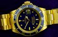
Gold Rolex = $$$ at pawn shops - world wide.by jimsappComment: While I like the combination and saturation of the colors here, I find the orientation of the watch to be troublesome and the lighting to be too harsh. Also wish the background were better lit. Good focus too. |
| 12/03/2003 11:20:50 PM |
Get whatever your little heart desires, Sugar!by drydocComment: Excellent take on the challenge and I like the composition very much, especially the bowtie on the candy...Very well placed! Only things I can see critiquing are the lighting being too harsh and I don't like that the two areas of the black background came out different looking. The lower left shows much more sparkles than the upper right. I enjoyed viewing this photo very much...well done, and good luck in the challenge...I'm rooting for you. |
| Photographer found comment helpful. |
| 12/03/2003 11:05:32 PM |
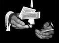
Poker Handsby jonpinkComment: Really nice use of negative space and I like the way the shirt cuff and hands are showing, but I find the shirt behind the cards distracting and wish it weren't showing. Also, it would have been nice to see both arms showing the white cuffs. If this were a staged shot, a ncie pair of colored or gold cufflinks would be good too. |
| Photographer found comment helpful. |
| 12/03/2003 10:59:56 PM |
BlackJackpotby eswikComment: I like the concept, but think it could have been carried out better. First, the lighting seems too harsh and there seems to be glare coming off the whites of the cards. Secondly, I would have preferred a green felt background to mimick the kinds of tables that poker is played on. I also would have preferred to see real coin scattered about and in more abundance than the stingy single token in the image. |
| Photographer found comment helpful. |
| 12/03/2003 10:20:52 PM |
'Backpack $149.99, Flight $845.99, Travel Experience: Priceless'by ellamayComment: The post-processing and application of blue duotoning gives this picture an eerie and other-worldly feel to it, as if I were viewing the surface of the moon from an orbiting lunar probe. IMO, this has done a disservice to the image as it appears to have degraded much of the surface detail that would have been present otherwise. I would have preferred to see this image in color, but even so, without your title, the photo doesn't speak to me of "money." |
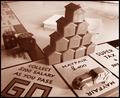
| 12/03/2003 09:47:41 PM |
Monopolyby marboComment: Not sure why you went for the sepia toning, but I don't think it adds anything to the image. I would have really liked to see this picture in color. Also, the lighting is too harsh and has given the image an overexposed look. I'm not really crazy about the triangular pile of houses. It seems their only purpose is to obscure a lacking top half of the photo. |
| Photographer found comment helpful. |
| 12/02/2003 11:54:22 PM |
Feeding The Sensesby ToddhComment: I ike the composition very much and even with the blownout highlights on the pot cover and wine bottle label, I find the exposure very good. I even like the grain/grit feel to this image. Only thing I find distracting is the bright circles near the hand and on the bottle in the background. |
| Photographer found comment helpful. |
| 12/02/2003 11:47:45 PM |
rising ringsby claudiadfComment: The photo appears to be of onion rings, and while I like the concept and treatment, I find it to be too obscure and abstract to think in terms of smell. Also, the hightlight is way too bright and distracting. |
| Photographer found comment helpful. |
| 11/28/2003 03:29:13 AM |
Winter Aromasby adineComment: I love your use of negative space here. Very creative composition. Just wish the colors were more saturated and it would have been nice to see a vapor trail rising from the hot coco. As it is now, the image leaves me a bit cold. |
| Photographer found comment helpful. |
Home -
Challenges -
Community -
League -
Photos -
Cameras -
Lenses -
Learn -
Help -
Terms of Use -
Privacy -
Top ^
DPChallenge, and website content and design, Copyright © 2001-2025 Challenging Technologies, LLC.
All digital photo copyrights belong to the photographers and may not be used without permission.
Current Server Time: 08/10/2025 10:16:43 AM EDT.