| Image |
Comment |
| 02/02/2004 11:56:44 AM |
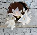
Youth and Ageby carlacrypticComment: Not exactly sure what connection you are making to the challenge them or how your picture conveys it. Aside from that issue, I think this is a good composition that has potential. I like the contrast of the softness of the flowers against the texture of the wall, as well as, the white petals and mottled pastel grey tones and would like more of those characteristics brought out. |
 Photographer found comment helpful. Photographer found comment helpful. |
| 02/02/2004 11:44:12 AM |
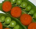
Peas & Carrotsby ladpupmoeComment: I like the saturated colors and composition. Good take on the challenge theme. The tiny specs of black on the carrot, which are dead center, are distracting and should have been cloned out. Also, don't like the glare coming off of the peas. |
| Photographer found comment helpful. |
| 02/02/2004 11:39:52 AM |
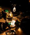
Props 'N Photosby RasaiComment: Hard to see what's here as it's too dark in most places, and too bright in others. Also, too much clutter and would have preferred more of a close up on just a few items that would have represented the concept you're trying to communicate. |
| Photographer found comment helpful. |
| 02/02/2004 11:37:10 AM |
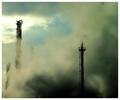
Industry&Pollutionby geewhyComment: I dont' think you're making enough of a link to industry here as all I see are towers and I'm not sure they by themselves are symbolic of industry. Would have preferred more of a wide angle shot to see that indeed the smoke does come from some kind of industrial processing. Also, the glare in the upper left is distracting. I certainly like your message, though. |
| Photographer found comment helpful. |
| 02/02/2004 11:27:57 AM |
Duetby whynotComment: Excessive grain and harsh lighting really detract from what could have been an interesting abstract. Colors look washed out and dull and I"m not sure I really find this to meet the challenge theme. |
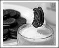
| 02/02/2004 11:21:28 AM |
Milk and Cookiesby RHoldenSrComment: A neat trick, but not enough to make the photo for me. I find it's hard to look at this picture. Maybe it's the harsh lighting and the glare on the plate or the shadow produced on the milk in the glass. I don't like the uneven focus on the cookies in the plate. Contrast is good, but this image cries out for some interesting tone or color. |
| Photographer found comment helpful. |
| 02/02/2004 11:04:54 AM |
College Survival Kitby bgartside47Comment: Looks like I can see your shadow top left and focus could be more crisp. I do like your take on the subject of cutting off the crust. |
| Photographer found comment helpful. |
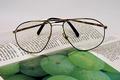
| 02/02/2004 10:55:53 AM |
Reading glassesby sn4psh07Comment: This version of this common subject matter brings nothing fresh or interesting and you've ignored the top third of the photo. |
| Photographer found comment helpful. |
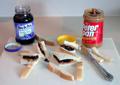
| 02/02/2004 10:52:29 AM |
CAMERA AND FILM - an antiquated unionby JeileenComment: Camera looks too dark and you've lost too much detail. Plus, the photo appears to have a yellow cast. Composition is good but I would prefer a less saturated background. |
| Photographer found comment helpful. |
| 02/02/2004 10:49:27 AM |
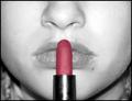
LipsStickby kncoughlinComment: I like the desaturation and composition. Lighting is too harsh and hot and is clearly visible in the lipstick holder. It has also caused a problem with loss of detail in parts of the cheeks and glare in the lips. It appears like her nose is running. Finally, the visible hairs around the nostrils and cheek are unsightly. |
Home -
Challenges -
Community -
League -
Photos -
Cameras -
Lenses -
Learn -
Help -
Terms of Use -
Privacy -
Top ^
DPChallenge, and website content and design, Copyright © 2001-2025 Challenging Technologies, LLC.
All digital photo copyrights belong to the photographers and may not be used without permission.
Current Server Time: 08/12/2025 08:28:27 AM EDT.