| Image |
Comment |
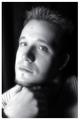
| 03/17/2004 11:34:47 PM |
expression of self...by theodor38Comment: I like this portrait alot as I find the subject compelling and interesting to look at...especially his hair, which imo carries the picture. The lighting is too harsh and you've lost detail in parts of the face and shoulders. Also, not too crazy about the green color of his eyes, as they look unnaturally colored. I don't think the background works here as the color doesn't match the eye color and it's print is somewhat distracting. |
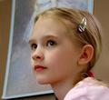
| 03/17/2004 11:28:28 PM |
Krissieby vtruanComment: This is a lovely portrait of a beautiful young lady and I love the concept here of having the painting in the background to which the subject is set against. I do, however, think there are improvements that can be made. First, I'm wondering if the painting has real relevence to the subject, in terms of, likeness or some kind of similarity. Also, I don't like the fact that the head of the subject in the painting was cut off. I do love the pose of your litte woman, and she is darling, but I would have preferred crisper focus on her face (it appears that the focus is better on the side of her face) and I also would have preferred that she wasn't wearing the shiny chrome barrette and red pony tail holder, both of which I find distracting. And also (sorry this is so long :), I think she should be wearing a colored blouse that matches better with the painting above and a color more subdued than the one she is wearing, which is bolder and does'nt match her lipstick or the painting. I hope this helps. 8 |
 Photographer found comment helpful. Photographer found comment helpful. |
| 03/17/2004 11:02:19 PM |
The Missusby redmoonComment: The overhead lighting has left unsightly shadows under her nose and chin. Some fill light could have been used to lessen them. In addition, I find your background to be too plain |
| Photographer found comment helpful. |
| 03/17/2004 10:52:15 PM |
Brandonby nsoroma79Comment: I think the lighting is a bit too harsh and strong on his face and his eyes could use a bit more saturation. Also, I don' t like the shadow that his hand is casting under his neck. |
| Photographer found comment helpful. |
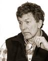
| 03/17/2004 10:33:04 PM |
Contemplating parallel linesby lwkimagesComment: Lighting appears a bit too harsh and photo is a bit overexposed as you've lost detail in some of the highlight areas. Also, do not like the background at all but I do find your capture of your subject compelling. |
| 03/17/2004 10:27:00 PM |
Smile!!!!!!!by lmatrangaComment: Looks a bit too noisy, which I don't find to be flattering for this beautiful boy. |
| 03/17/2004 09:57:52 PM |
Natural Beautyby labudsComment: Beautiful model but it looks like you have a mixed lighting thing going on that is spoilng the shot. Her right arm is blurred and the background is distracting and too plain. |
| 03/14/2004 11:31:35 AM |
Crux Criticorumby dsrayComment: Very difficult lighting situation to shoot under with the mix of natural outdoor and incandenscent indoor lighting. Left side of photo has a yellow/green tint to it. In addition, there appears alot of noise that's degrading picture quality. |
| 03/14/2004 12:52:35 AM |
The Viagra Experimentby LouisonComment: Hahahahahaha...I can't stop laughing from this shot. Very creative and your subjects look is hilarious!!! Good that you took it in front of the shower curtain...Very well done. 10 |
| Photographer found comment helpful. |
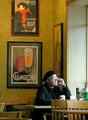
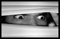
| 03/14/2004 12:25:08 AM |
"REAR WINDOW"by cjavierComment: Excellent ! I love the look on your subjects face and also love the b&w and the heavy grain. Gives a very good horror look. Maybe a little bigger next time? Well done though. |
| Photographer found comment helpful. |
Home -
Challenges -
Community -
League -
Photos -
Cameras -
Lenses -
Learn -
Help -
Terms of Use -
Privacy -
Top ^
DPChallenge, and website content and design, Copyright © 2001-2025 Challenging Technologies, LLC.
All digital photo copyrights belong to the photographers and may not be used without permission.
Current Server Time: 08/15/2025 11:36:58 AM EDT.