| Image |
Comment |
| 09/07/2006 01:37:20 PM |
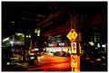
under the tracksby k4ffyComment: Too much saturation. Too blown out on the "Food world". too little detail in the shot in general. |
 Photographer found comment helpful. Photographer found comment helpful. |
| 09/07/2006 01:36:29 PM |
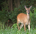
It\\\'s A Doe Dearby JOHNBOY1970Comment: Too much negative space to the left. A closer crop would improve the image. Also, what are the \\\'s in the title for? |
| Photographer found comment helpful. |
| 09/07/2006 01:35:08 PM |
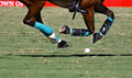
Basics of the Gameby GermaineComment: Pretty good stop action. I wish the back right hoof was more sharp. Also would be improved by the mallet being in play! |
| 09/07/2006 01:34:07 PM |
Alcoholics Anonymousby RiderGalComment: Focus is wrong (top of bottle blurry) and the humor just not that good to compensate for the ugly background and lackluster forground. |
| Photographer found comment helpful. |
| 09/07/2006 01:32:44 PM |
Bird of Preyby jimikaComment: Too blown out on top of the head (though as a balding man I appreciate the difficulty of lighting such... LOL!) I'm also just not sure that the focus is there enough. |
| Photographer found comment helpful. |
| 09/07/2006 01:31:19 PM |
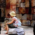
Contemplateby TejComment: This would be better if the model were contemplating something in the other direction or she were on the right-hand side of the frame. Also, the blobs framing the shot are distracting and should be cropped out. (A portrait 4x6 crop should do it.) |
| Photographer found comment helpful. |
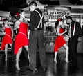
| 09/07/2006 01:29:31 PM |
Do you want to dance with me?by zaflaboutComment: OK job on the selective color, but there are some major flaws. For instance, the nearest girl (who is a stunning beauty, btw) has a glow of fleshtone around her ruby lips that makes her look a bit wierd and there are artifacts on the legs of all of the lovely ladies. I'm not too sure about the composition, though I can't say what I would have done to make it better. The background is too busy and the selective color is just a bit too over the top, even for advanced editing. I also could do without having the scrawny, baggy panted rear of the Harry Connick, Jr. wanna-be in front so prominent in the frame! LOL! |
| Photographer found comment helpful. |
| 09/07/2006 01:22:21 PM |
XIby bragurComment: It is unclear what this is and why it should be interesting. |
| Photographer found comment helpful. |
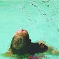
| 09/07/2006 01:20:02 PM |
A study in H2O 2by DragonphenxComment: Nice stop action, but it took too long for my eyes to find the splash for the image to work well. The slightly blurry swimmer grabs the eye and it takes a few beats to see the splash, which is the true subject of this image. I think a looser crop would improve that. Also making it more landscape and less square would help. |
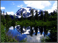
| 09/07/2006 01:17:15 PM |
Cascade Reflectionsby madhatterComment: If the sky weren't blown out it would be better. Also, I don't like the composition. The mountain being further left in the frame, at the expense of the uninteresting left end of the lake, and a crop just below the tree reflections would improve the shot. |
| Photographer found comment helpful. |
Home -
Challenges -
Community -
League -
Photos -
Cameras -
Lenses -
Learn -
Help -
Terms of Use -
Privacy -
Top ^
DPChallenge, and website content and design, Copyright © 2001-2025 Challenging Technologies, LLC.
All digital photo copyrights belong to the photographers and may not be used without permission.
Current Server Time: 08/25/2025 02:04:37 AM EDT.