| Image |
Comment |
| 09/12/2006 12:32:04 AM |
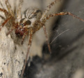
Catchlightsby ralphComment: Could use a bit deeper DOF, and I would prefer to see they whole spider, but nice placement! |
| 09/12/2006 12:30:57 AM |
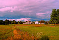
KENNEBUNK FARMby whitewolfComment: I suppose that the fence goes across a thirds intersection, but the rest of this photo, while pleasing in color and content is in violation of the Rule of Thirds. The barn is smack in the middle of the picture, the horizon line is also lined up in the middle. I guess you could argue that the house and white faced barn are at the thirds line on the right, but they are definately not at an intersection. Whether the image works better this way or not is debatable, but I don't think it meets the challenge criteria. |
| 09/11/2006 12:43:10 AM |
|
| 09/08/2006 12:20:11 AM |
"left behind"by crystallineComment: Right behind too.... :) Congrats on only having 2 1's with a nude! I think that is a record! |
 Photographer found comment helpful. Photographer found comment helpful. |
| 09/07/2006 02:10:06 PM |
Beauty In Silkby SiggikalliComment: Too busy and bright in the background. It makes it hard to see the very nicely done detail in the rose. |
| Photographer found comment helpful. |
| 09/07/2006 02:09:27 PM |
Mother & Childby manic35Comment: Needs a touch more contrast between shirt and baby. I like the high key otherwise. Well composed, but a tiny bit too much negative space. The mothers foot on the left is A) cut off, and B) blurry! |
| Photographer found comment helpful. |
| 09/07/2006 02:07:22 PM |
Brotherly Loveby chrissycampbellComment: A bit soft and small. Needs more contrast if you are going to do black and white with such a nothing background and such fair children. |
| 09/07/2006 02:06:18 PM |
Riannaby christie3Comment: Very attractive picutre of an attractive young lady! The wisps of hair should either be more pronounced or smoothed back and out of the way. There is a spot on her lower lip that could be cloned out and it would improve the image. The lighting could be a bit better on the right side (her left) of the face. |
| Photographer found comment helpful. |
| 09/07/2006 02:04:02 PM |
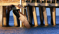
Flightby naplesmuscComment: Good work! Very sharp and good stopped motion! The background is a bit blah, but I don't suppose the bird would take direction well! :) |
| Photographer found comment helpful. |
| 09/07/2006 02:02:57 PM |
|
| Photographer found comment helpful. |
Home -
Challenges -
Community -
League -
Photos -
Cameras -
Lenses -
Learn -
Help -
Terms of Use -
Privacy -
Top ^
DPChallenge, and website content and design, Copyright © 2001-2025 Challenging Technologies, LLC.
All digital photo copyrights belong to the photographers and may not be used without permission.
Current Server Time: 08/25/2025 05:04:38 AM EDT.