| Image |
Comment |
| 03/23/2006 02:12:16 PM |
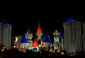
Excaliburby liiina76Comment: Your image has a nice low-key histogram but I suspect some folks will still not think this is low-key because of the colors. Converting it to B&W would be more convincing to them. That is why you see more low-key images in black and white than in color. The image is a bit on the small size and it does not have as good of sharpness as it could.
But to show you that great minds think along similar lines here is a picture taken from the same spot as you that I once entered in a challenge:
 |
 Photographer found comment helpful. Photographer found comment helpful. |
| 03/22/2006 12:12:28 PM |
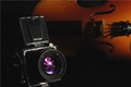
To Create Artby gotthoffnungComment: Nice tonality in this low key composition. Never heard of a camera called a "Kiev". I thought that was a city in Ukraine. ;) |
| Photographer found comment helpful. |
| 03/22/2006 11:59:49 AM |
|
| Photographer found comment helpful. |
| 03/15/2006 10:28:31 AM |
School Daysby JudiComment: Very nice composition with great RGB colors and you captured a terrific expression. It is an appealing composition.
I will join the chorus of others pointing out that the out-of-focus apple in the subject's hand is a major distraction. Out-of-focus foreground generally does not work as well as out-of-focus background in most cases anyway but it is exceptionally distracting in this one because the apple is a major element in the composition. |
| Photographer found comment helpful. |
| 03/15/2006 10:13:04 AM |
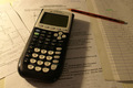
"Modern education"by squeeky jeeComment: The arrangement and composition of this image is fine.
Lighting and color could be improved. The shadow of the calculator distracts from the image. Adding lighting from the right would mute the distaction, illuminate right side detail and add interest to the image.
White balance is off which gives it a yellow hue that should be corrected in post processing.
You might also consider shifting your central focus point from the center of the calculator to the "5" on the keypad. That would excentuate the effect of your shallow depth of field and minimize the distracting effect of having the near foreground slightly out of focus. |
| Photographer found comment helpful. |
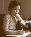
| 03/15/2006 10:04:10 AM |
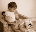
Education begins earlyby cvhs99Comment: Use of sepia in this composition works well and you captured your young subject at a moment of discovery and learning. This image captures true education far better than 98% of the images that will score above it.
The biggest defect in this image is focus. Your model should be in tack sharp focus. You can see that your autofocus decided the background should be focused and not your subject since it occupies more space.
Your perspective is not necessarily bad but is "snapshot-like". Taking it from the right up from floor level where you could see the whole face might be worth trying. You can't see the contents of the book from that perspective but you have a different angle and the facial expression is what makes the image. The contents of the book are inconsequential.
You might also consider a tighter crop and cut out as much wall in the background as possible. It adds little to the composition and the wall plug is a major distraction. There is a tendency for photographers to include the entirety of an object, like the book on the right, in the image. But you can achieve a very pleasing effect by including part but not all of an object. Cropping out part of the book would achieve that effect as well as get rid of the wall plug. |
| Photographer found comment helpful. |
| 03/15/2006 09:45:01 AM |
Enlightenmentby pineappleComment: Nice composition and sepia works well. Well focused. You captured your subject in a studious pose.
The image lacks a full tonal range. Try this... set a black point at the darkest spot in the composition and you may find the image will maintain its current tonality but will have much better contrast and will stand more. It is a little "flat" as it is currently. In photography there is a constant battle between tonality that shows nice gradations from one tone to another and contrast which washes out tones. It is hard to find the happy medium. |
| Photographer found comment helpful. |
| 03/15/2006 09:34:56 AM |
I Can't Go To School Today Dad, I'm As Sick As A Dog!by Penny LaneComment: Good composition, great concept, needs to have better focus on the dog's head. Looks like the dog moved during the shot since the near foreground is focused and the background tie is focused. The object (ruler?) under the dog's chin is a distraction. |
| Photographer found comment helpful. |
| 03/15/2006 01:36:07 AM |
|
| Photographer found comment helpful. |
| 03/06/2006 06:31:16 PM |
|
| Photographer found comment helpful. |
Home -
Challenges -
Community -
League -
Photos -
Cameras -
Lenses -
Learn -
Help -
Terms of Use -
Privacy -
Top ^
DPChallenge, and website content and design, Copyright © 2001-2025 Challenging Technologies, LLC.
All digital photo copyrights belong to the photographers and may not be used without permission.
Current Server Time: 08/14/2025 10:17:00 AM EDT.