| Image |
Comment |
| 03/25/2006 06:23:23 PM |
watcher at the gateby yetiComment: This image is tough to judge. It does not have any overexposed areas but is in color and does not fit the classic mode of low-key imagery. It looks like there is some color noise in places that should be corrected. There is not a lot of strength to the composition and that will hurt it. Viewers may find the branch shadows to be distracting because they will not be able to discern why they were included in the composition. Though voters will understand the connection between the flag and border it appears that it is not uniform in width all the way around. |
 Photographer found comment helpful. Photographer found comment helpful. |
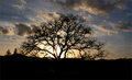
| 03/25/2006 06:15:10 PM |
Sunsetby ZhemaitisComment: I like the idea of this image. Trees with sinuous branches make great photography subjects and silhouettes make great foreground interest items for sunsets.
There are things that will impact this image's score. Though not terribly small this image would benefit if it were larger and that the added part showed more sky and clouds. Color processing could bring out more drama in the sky and, though you have no control over it, the telephone or power lines in the background are a distraction. Overall the claityof the image is not as good as it could be.
The biggest scoring impact will be that many voters will not see this as a low-key image because it has more tonality in the midtones than in the shadows and will vote it lower because of it. |
| Photographer found comment helpful. |
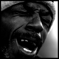
| 03/25/2006 06:03:10 PM |
burdenedby SkipComment: This is the quintessential low-key image. Very powerful. I don't like the graininess on the lower left but it probably fits the image well in the eyes of most voters. Because it is such a good picture and that it is such a classic low-key type image it should place very high. |
| Photographer found comment helpful. |
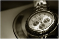
| 03/25/2006 06:00:06 PM |
Fossilby goinskiingComment: I'd practically kill to take pictures with the amazing tonality of this one. Ribbon quality, for sure. Everything about this picture is perfect... tones, lighting, focus, DOF, composition. I think I hate you. LOL! |
| Photographer found comment helpful. |
| 03/25/2006 05:55:44 PM |
Derekby elru21Comment: Wow... what a beautiflly done portrait. Great lighting, great angle, superior tonality. This is one of the very best images in the challenge. If there one thing that you might try it would be to shot it at an f/stop or so narrower to get a little more depth of field so that the beard is in a little more clearer focus but still narrow enough for a good background blur. |
| Photographer found comment helpful. |
| 03/25/2006 05:51:42 PM |
Dark toneby JAGQComment: I just plain like good pictures and yours is beautifully done. Tones and composition are great and it is a technically superior image. |
| Photographer found comment helpful. |
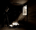
| 03/25/2006 05:50:08 PM |
Composing The Shotby rob_franklinComment: Very nicely done. This is one of the best images in this challenge. The harshness of the bright light coming in from the outside coupled with the choice of sepia and inclusion of dark tones makes this a terrific composition. Bright outlines on a human figure is a classic feature of low-key images and there is no highlight detail inside at all. It is not immediately obvious why the model is holding their hands to their face and will distract some viewers. Message edited by author 2006-03-29 09:36:07. |
| Photographer found comment helpful. |
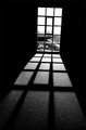
| 03/25/2006 05:44:13 PM |
The Sunshine's Eclipse Windowby KrisbyComment: What a fabulous composition. I really like this picture a lot. This is clearly one of the top images in the challenge. It fits the more common definition of low-key which references image tonality in the shadows and lack thereof in the highlights moreso than the challenge description. Some voters here will probably think it is to "bright" and it will get some low votes because of it. Sure hope not. Great job! |
| Photographer found comment helpful. |
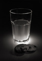
| 03/25/2006 05:36:12 PM |
Milk And Cookiesby knuteComment: The way you have your lighting setup is the major strength of this composition.Too bad that basic rules do not allow for fixing the blemish on the right hand side. Unsure if the cookies add significantly to the composition. Without them the tones surrounding the glass would be more prominent which would be worth seeing. It would have simplicity similar to this recent ribbon winning image by kiwiness:
 |
| Photographer found comment helpful. |
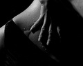
| 03/25/2006 05:24:03 PM |
Another Black & White Entryby sir_bazzComment: Well composed, nice skin tones and good definition in the hand and water droplets. Lighting is very good. Very interesting composition.
Not intending to be perverse but you might try for a little more tonal detail on the underwear. Maybe weak lighting from below and to the left, but just enough to show some near black tones that makes it more sensual without being sexual would be worth trying. It would be nice if the large drop near the little finger were made up of many smaller ones that are larger but like the others nearby.
This is one of the best images in the challenge. |
| Photographer found comment helpful. |
Home -
Challenges -
Community -
League -
Photos -
Cameras -
Lenses -
Learn -
Help -
Terms of Use -
Privacy -
Top ^
DPChallenge, and website content and design, Copyright © 2001-2025 Challenging Technologies, LLC.
All digital photo copyrights belong to the photographers and may not be used without permission.
Current Server Time: 08/14/2025 08:30:46 AM EDT.