| Image |
Comment |
| 06/20/2005 01:42:55 PM |
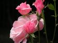
beauty alone in the darkby jessgirlComment: Great focus, good color and nice composition. Exposure is right and there are no overexposed areas.
Voters will trash this for being a flower image submitted to a darkness challege. Having a black background will not be good enough for them.
On the technical side there are a couple improvements that could be make. The depth of field (DOF) is very shallow. The closest bud and leaf on the right side are in clear sharp focus but most of the rest is not. For this image everything probably should be in very sharp focus. This could be correct two ways. One would be to focus on the center flower and hope DOF will keep everthing from front to back in focus. The other way is to take the image at a longer shutter speed and narrower aperature to increase DOF. Or possibly both.
There is a light colored area in the black background to the left of the flowers that is distracting to the human eye. Viewers either want to see it better to know what it is or they don't want it in the composition at all. It could be removed by increasing image contrast a little more. That always results in some loss of detail so you have to decide on a balance between the two. |
| 06/20/2005 01:31:48 PM |
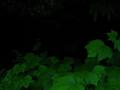
Into the Darkby WendelikaComment: A valient attempt to capture the dark side of an enchanted forest.
Poor focus is what will hold dow the score of this image more than anything else. It appears that the darker background ferns are in better focus than the foreground leaves. This could be because your camera's autofocus was fooled into focusing on the wrong place. This is a common problem with autofocus cameras in low light situations. Looks like it is focused at infinity.
In order for this image to work well with reviewers you would need to have the foreground leaves be in absolutely razor sharp focus with very fine detail plainly visible. And if you could add something into the darkened area that is partly illuminated but that viewers could recognize and relate to then you could have a ribbon winner on your hands.
|
 Photographer found comment helpful. Photographer found comment helpful. |
| 06/20/2005 01:25:30 PM |
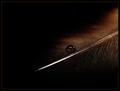
Tar and Featherby sherComment: In general it is an appealing image. The addition of the water drop is nice. brown tones are good.
You can't get rid of these because it is a basic challenge but the tiny white specks throughout the image is a major distraction in this composition and will hurt it's overall score. |
| Photographer found comment helpful. |
| 06/20/2005 01:15:44 PM |
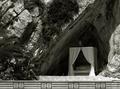
To sleep, perchance to dreamby BebeComment: Most viewers will see nothing wrong with this mage that even hints that it needs to be disqualified. Midtones are good and the framing using the lower wall is an excellent idea.
This does not look like a true B&W. It looks more toned. Contrast seems slightly weak but not bad. Photographically, the placement of objects in the frame is fine. and the curtained enclosure is well placed.
Voters will have difficulty making a strong connection to the darkness theme and probably will vote it lower because of it. It is fascinating to have an outdoor bed complete with formal lighting in a cave-like enclosure. It certain should give voters plenty to think about. :)
The main technical flaw is the overexposed part of the curatin that is in direct sunlight. It would have been better if you had went and pulled that out of the sunshine before taking the picture.
|
| Photographer found comment helpful. |
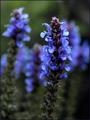
| 06/20/2005 01:05:13 PM |
Before the Stormby admart01Comment: Generally a nice image. DOF is OK and the focus is OK on the near flower. The composition is basically good. It is always best to take flower pictures away from direct sunlight like you have done here. You get better detail then.
This image has two issues that will cause it to get a low score. Connection to the challenge topic and technical quality.
Obviously you are going to be throttled for entering a flower picture in a darkness challenge. You are probably already aware of that.
On the technical side the contrast on this image is wrong. To prove this all you have to do is select autocontrast in your editing software and there will be a dramatic improvement and the image will look much better.
The blue of the foreground flower conflicts with the blue of the background shallow focused flower on the left. That makes it harder for the human eye to discern detail and therefore we don't like the image as much. To avoid this you should have just removed the middle background flower or repositioned so the color conflict was not in the composition.
The focus is not bad. Generally speaking, though, razor sharp focus works best with floral images and this is a little on the soft side. |
| Photographer found comment helpful. |
| 06/20/2005 12:53:01 PM |
Where there is Darkness there is a Light of Hope!by arpitmittalComment: There is little in this composition to entice voters to give it a high score.
The technical quality is generally decent except for electronic noise that probably should be removed. The overexposed ligh streak lacks viewer interest.
It is the composition that will give voters a problem. There is little in the composition that a viewer can relate to. Nothing wrong with abstract images, but you have to give the viewer something to relate it to. You suffer from the double whammy that abstracts generally are not accepted all that well by this group.
The viewer's first impression is, "What is this?" It really does not provide them with a enough reason or desire to speculate.
Something you might do to increase interest would be to used multi-colored lighting. This image, though in color, really does not have any. Nice strong reds, greens or blues would make this a lot more pleasing and interesting for viewers. |
| Photographer found comment helpful. |
| 06/20/2005 12:42:58 PM |
Waiting...by frogletComment: Nice bird macro. Good clarity and lighting.
Unfortunately voters will view this as your outtake from the bird challenge that you submitted just for the sake of suubmitting something and vote it lower because of it.
On the technical side the background is not solidly black. The detail visible on the wall is a distraction from the bird. You make have left that in an attempt to add some background interst but it will probably not work with most viewers. The contrast in this image is a little wek to start so increasing it would lessen the influence of the dots on the background and give the image a little more pop.
You might consider a color adjustment to bring out the color of the owl's eye more. There is also a little yellow around the neck that would show up more as well. That would really make it nice. |
| Photographer found comment helpful. |
| 06/20/2005 12:36:14 PM |
Checkmate; Darkness for the Kingby fd3rdComment: Good solid black background and intersting brown tones on the board and pieces. DOF is OK.
It is doubtful voters will see a strong connection with the challenge topic.
On the technical sie the pieces are not horizontal and that is a major distraction. It makes image lopsided. The white king is slightly overexposed on the right side and it would be nice if it were just a touch darker there. Though generally good the focus is a little soft for an image with a simple presentation like this one. It would be better if the pieces were in razor sharper focus. |
| Photographer found comment helpful. |
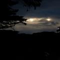
| 06/20/2005 12:30:32 PM |
The hounds of hell have eyes of fire...by burtctComment: Excellent quality silhouette. Good clarity and solid blacks. The natural framing with the tree branches is very good.
Though the two bright openings in the clouds are why you took the picture in the first place they are both overexposed spots which is really a defect in most images. It is very difficult to get lighting correct in a basic challenge like this without overexposing them.
On the technical side there is a lot of dark space at the bottom of the frame. There is something like a reflection down there but the viewer really cannot tell what it is. When that happens the item becomes a distraction in the image. You might consider cropping out the whole bottom portion of the image. That will better highlight the part you originally took the picture for anyway. |
| Photographer found comment helpful. |
| 06/20/2005 12:23:26 PM |
Lurkingby BlinksComment: Good solid black background and meest the challenge topic well.
There are a lot of setup images like this in the challenge so voters tend to get jaded on them after they have seen a lot of them. This especially true her because of the large number of entries. Yours will suffer scorewise because of that.
The lighting itself on your subject is good but the color appears oversaturated and the focus is to soft. The later is likely intentional but voters will interpret it as a sign of a poor quality image that you tried to save through post processing. |
| Photographer found comment helpful. |
Home -
Challenges -
Community -
League -
Photos -
Cameras -
Lenses -
Learn -
Help -
Terms of Use -
Privacy -
Top ^
DPChallenge, and website content and design, Copyright © 2001-2025 Challenging Technologies, LLC.
All digital photo copyrights belong to the photographers and may not be used without permission.
Current Server Time: 08/18/2025 02:37:10 PM EDT.