|
|
|
Showing 311 - 320 of ~977 |
| Image |
Comment |
| 07/19/2006 08:31:42 PM | Cloud 9by DefyTimeComment: Ooo, cool photo! you might try selectively taking the yellow out of the background and adding more blue, maybe a filter over the clouds, or a gradient from blue to the natural yellow sun... or burning the top right, bottom right and bottom left corners just a tad... idk... but I really love the relaxing feel of this photo |  Photographer found comment helpful. Photographer found comment helpful. |
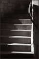
| 07/19/2006 08:28:26 PM | Stairsby MelethiaComment: nice composition and shadows, this one definitely caught my eye. I'm not sure how it would look, but you might play around with burning the banister and upper right hand corner to eliminate that spot from competing for attention w/the rest of the photo | | Photographer found comment helpful. |
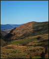
| 07/19/2006 04:47:08 PM | The Hills have Linesby AgaricusComment: Hahahahaha!! saw that movie, hate scary, gorry movies, but this is funny, and nice picture too, perfect exposure, beautiful color, love the composition, would vote this a 7, but bump 8 for creative humor | | Photographer found comment helpful. |
| 07/19/2006 04:26:17 PM | Darned Typos!by GeneralEComment: hahaha! ... funny, I bet you're getting the crap beat out of your score though, wish the focus were sharper on your cut lime, but I really like your composition, also, maybe a boost in saturation and/or contrast, 7 for out of the box | | Photographer found comment helpful. |
| 07/19/2006 02:39:13 AM | | | Photographer found comment helpful. |
| 07/18/2006 09:29:53 PM | Corneredby meo729Comment: Critique Club Comment
Initial thoughts: Very brown, a little dull, and the focus is off, but definitely meets the challenge
Subject & background: I like the weathered old pages look, but I'm not sure I like the texture of what appears to be corkboard, also the brown on brown is a little much, like someone suggested, maybe this would look nice in BW or sepia or just a different background... also, I like the idea that's been suggested of having something written on the pages
Angle, framing & composition: I think you've done some nice work here, I would prefer a more squarish crop, maybe some more space at the bottom, but placement and balance seem right
Focus, clarity & DOF: I think this is what got you the most... seems your focus is on the ground (cork?) directly below the book and then out of focs toward the edges, which is a little dizzying given the texture and then your subject, the page corners, are out of focus, a deeper DOF could help you out, I'm looking again, and maybe that's motion blur? either way, crisp clean page edges would have definitely boosted your score
Lighting & exposure: lighting looks even and exposure is also good
Post processing: again, maybe BW
Overall, my opinion: fairly good photo, I think you had a nice idea to work with here, nice subject, seems the focus and the background are the main things to improve
If you have any questions regarding this critique, feel free to PM me
Amanda |
| 07/18/2006 09:11:30 PM | A single Monumentby moekyleComment: Critique Club Comment
Initial thoughts: Wow, I think you've gotten some pretty helpful comments already and your photo definitely meets the challenge
Visual appeal: You can at least tell what the subject is. For DPChallenge, the best scoring photos are very colorful, emotional and/or extremely technically skilled
Subject & background: sky and clouds and monument seem flat, meaning there aren't any dramatic shadows or colors to give more interest
Angle, framing & composition: Rule of thirds: there are imaginary lines that divide your photo into thirds, both horizontally and vertically, and usually it is best to place the subject in your photo on one of the intersections of these imaginary lines, and with that being said, I think the only other thing you might of done with this pic would have been to shoot the monument from right underneathe; however that would have required a very wide angle lens
Focus, clarity & DOF: There doesn't really seem to be a specific point of focus and the monument could use some sharpening, though the photo is not blurry which is a plus
Lighting & exposure: You've done a good job not overexposing the sky or monument while not underexposing the trees. What you might have tried with this shot would have been to wait for a colorful sunset or sunrise to really bring this out
Post processing: I think that you could boost the contrast and saturation levels to try and bring out the clouds and the monument from the rest of the picture
Overall, my opinion: I think this is a pretty good start to DPC, welcome and good luck in future challenges
If you have any questions regarding this critique, feel free to PM me
Amanda | | Photographer found comment helpful. |
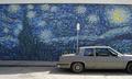
| 07/18/2006 08:48:27 PM | Starry Streetby DefyTimeComment: Originally posted by TomFoolery:
That's the part I liked...like the old car and sign in the shot...very urban |
lol, I'm a painter at heart, I completely skipped the photographic value of this pic... now I see | | Photographer found comment helpful. |
| 07/17/2006 12:23:52 AM | | | Photographer found comment helpful. |
| 07/17/2006 12:20:00 AM | | | Photographer found comment helpful. |
|
Showing 311 - 320 of ~977 |
Home -
Challenges -
Community -
League -
Photos -
Cameras -
Lenses -
Learn -
Help -
Terms of Use -
Privacy -
Top ^
DPChallenge, and website content and design, Copyright © 2001-2025 Challenging Technologies, LLC.
All digital photo copyrights belong to the photographers and may not be used without permission.
Current Server Time: 06/27/2025 03:15:44 PM EDT.
|