| Image |
Comment |
| 04/26/2006 02:47:47 AM |
|
| 04/26/2006 02:46:36 AM |
tip toeby gtp1164Comment: Bit wrong to be complementary. Beautiful colours though. |
| 04/26/2006 02:45:37 AM |
|
| 04/26/2006 02:44:25 AM |
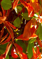
orangenessby ronragComment: I don't know if there's enough 'editing permission' in this challenge to have bued up the boat a bit? |
| 04/26/2006 02:43:09 AM |
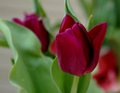
Shelterby balmikiComment: Good picture. Red's not red enough for the challenge. |
 Photographer found comment helpful. Photographer found comment helpful. |
| 04/26/2006 02:42:17 AM |
|
| Photographer found comment helpful. |
| 04/26/2006 02:41:50 AM |
Simple Touchby idnicComment: Nice idea. Too much dead space. The extra dark/light difference is a problem with pigments. |
| Photographer found comment helpful. |
| 04/26/2006 02:40:35 AM |
Notesby JRalstonComment: Difference in tone quality between the two colours detracts, IMO |
| Photographer found comment helpful. |
| 04/26/2006 02:39:32 AM |
Niceby LilhoopComment: Complementary art nouveau. Funny how organic shapes are totally chaotic and nevertheless harmonic... |
| 04/26/2006 02:38:34 AM |
|
| Photographer found comment helpful. |
Home -
Challenges -
Community -
League -
Photos -
Cameras -
Lenses -
Learn -
Help -
Terms of Use -
Privacy -
Top ^
DPChallenge, and website content and design, Copyright © 2001-2025 Challenging Technologies, LLC.
All digital photo copyrights belong to the photographers and may not be used without permission.
Current Server Time: 08/11/2025 04:04:30 PM EDT.