| Author | Thread |
|
|
05/07/2006 01:52:03 PM |
Comment:
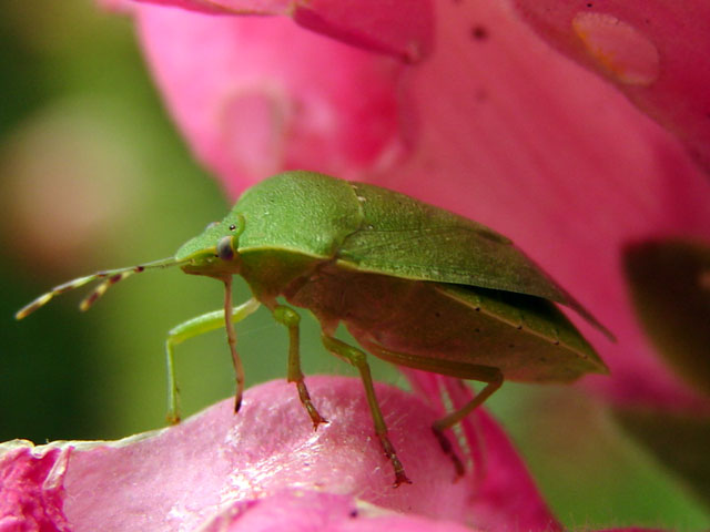
Hello from the Critique Club!!!
Composition:
The composition of this shot is just a little off. Maybe the crop is a bit too tight.
Background/ Foreground
The shallow DOF has the background blurred, I think a sharper image of the flower would have worked better and raised the scores
Camera Work:
A sharper focus as stated above would have helped, shooting macro can be difficult and getting it all in perspective is a challenge all it's own.
Post-Processing:
To meet the challenge correctly I would have made the pink just a little more red.
My Opinion:
This is a nice shot but a few things could make a great shot, a better focus and (DoF) and possibly a different angle.
I hope you find these comments to be helpful, thank you for allowing me to critique your picture. If you have any questions or concerns feel free to contact me via PM.
Best of luck in your future photographic endeavors,
Regards,
Karen Doss
|
|
Comments Made During the Challenge  |
|
|
05/02/2006 10:05:57 PM |
|
Great photo-i could see it on a poster, etc. |
|
|
|
04/30/2006 09:59:41 PM |
|
|
|
04/30/2006 05:50:20 PM |
|
Pink and green aren't complementary colors... red and green are. |
|
|
|
04/30/2006 11:23:57 AM |
|
the bug is cool the rest not really |
|
|
|
04/30/2006 01:39:33 AM |
|
Needs a bit more sharpness. |
|
|
|
04/29/2006 11:35:29 PM |
|
|
|
04/29/2006 11:11:53 PM |
|
Great natural complementary colours shot and I like the perspective too. Good luck, hope you do well. |
|
|
|
04/29/2006 03:33:18 AM |
|
This image just needa bit more sharpness to it it seems. |
|
|
|
04/27/2006 09:48:23 PM |
|
3 - Like this, but a little too close in my opinion (OOF), and also, I'm seeing more pink/green here than red. Perhaps adjusting the hue in pp may have helped create a stronger image for the Challenge, who knows. |
|
|
|
04/27/2006 08:43:11 AM |
|
very nice at first glance i almost mistaked the bug as a leaf |
|
 Photographer found comment helpful. Photographer found comment helpful. |
|
|
04/26/2006 11:21:30 PM |
|
|
|
04/26/2006 12:27:35 PM |
|
The flower look more like a pink to me. Nice idea though. Perhaps you could adjust the reds using hue! |
|
|
|
04/26/2006 06:37:05 AM |
|
good work, but not quite sharp enough where it matters |
|
|
|
04/26/2006 02:43:09 AM |
|
Good picture. Red's not red enough for the challenge. |
|
| Photographer found comment helpful. |
Home -
Challenges -
Community -
League -
Photos -
Cameras -
Lenses -
Learn -
Help -
Terms of Use -
Privacy -
Top ^
DPChallenge, and website content and design, Copyright © 2001-2026 Challenging Technologies, LLC.
All digital photo copyrights belong to the photographers and may not be used without permission.
Current Server Time: 06/28/2026 08:11:53 PM EDT.