| Image |
Comment |
| 06/29/2007 04:46:44 AM |
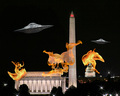
Invasion!by SJCarterComment: a good idea but, I don't know why, the realization seems few credible. |
 Photographer found comment helpful. Photographer found comment helpful. |
| 06/29/2007 04:42:52 AM |
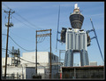
Building Madnessby BlackboxComment: interesting solution, perhaps is a my bad idea but I prefer most space on the top. here the "robot" is too much crushed by the frame. |
| Photographer found comment helpful. |
| 06/29/2007 04:39:04 AM |
|
| Photographer found comment helpful. |
| 06/28/2007 04:33:53 PM |
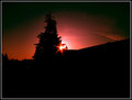
Early Morning Riseby drewhosickComment: the composition is good and i like the idea. the dark area on the low side is too much big. clone out the small red point on the middle-left and the last pole piece. |
| 06/28/2007 10:07:19 AM |
|
| Photographer found comment helpful. |
| 06/28/2007 09:58:39 AM |
|
| Photographer found comment helpful. |
| 06/28/2007 09:55:18 AM |
|
| Photographer found comment helpful. |
| 06/27/2007 08:00:09 PM |
One by dreamyComment: simple and very good image. |
| Photographer found comment helpful. |
| 06/27/2007 07:59:45 PM |
|
| Photographer found comment helpful. |
| 06/27/2007 07:58:08 PM |
Lone Riderby whiteflyerComment: you was in a bad position for this photo. unfortunately the contest run with the basic editing rules and the pole on the head of the rider isn't beautiful. even the blue on top-right side is a bit distracting. 6 |
| Photographer found comment helpful. |
Home -
Challenges -
Community -
League -
Photos -
Cameras -
Lenses -
Learn -
Help -
Terms of Use -
Privacy -
Top ^
DPChallenge, and website content and design, Copyright © 2001-2025 Challenging Technologies, LLC.
All digital photo copyrights belong to the photographers and may not be used without permission.
Current Server Time: 08/14/2025 11:11:16 PM EDT.