| Image |
Comment |
| 04/27/2008 09:50:40 AM |
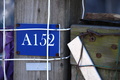
152by johnmcbostonComment: What even makes this seem like a good submission? How do you look at this and think "Man, everyone will love this picture of a sign on some wood"? |
| 04/27/2008 09:50:05 AM |
|
| 04/27/2008 09:49:54 AM |
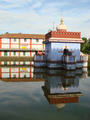
Holy Waterby romilComment: Like the colors. Would have appreciated either a greater OR more shallow depth of field. The building in the back takes up so much of the frame that it either needs to be lost in the bokeh or tack sharp. As it is, it just likes moderately out of focus, which makes the whole shot look sloppy. |
| 04/27/2008 09:48:13 AM |
|
 Photographer found comment helpful. Photographer found comment helpful. |
| 04/27/2008 09:47:52 AM |
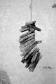
P?NPby taseComment: I could see this as a poster. A boring poster. But a poster nonetheless. |
| 04/27/2008 09:47:35 AM |
|
| 04/27/2008 09:45:12 AM |
|
| 04/27/2008 09:44:48 AM |
|
| Photographer found comment helpful. |
| 04/27/2008 09:44:20 AM |
|
| Photographer found comment helpful. |
| 04/27/2008 09:43:45 AM |
|
Home -
Challenges -
Community -
League -
Photos -
Cameras -
Lenses -
Learn -
Help -
Terms of Use -
Privacy -
Top ^
DPChallenge, and website content and design, Copyright © 2001-2025 Challenging Technologies, LLC.
All digital photo copyrights belong to the photographers and may not be used without permission.
Current Server Time: 08/20/2025 04:48:18 PM EDT.