| Image |
Comment |
| 12/02/2006 11:36:18 PM |
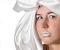
Satin Dollby graphicfunkComment: Likes: good focus on the eyes. The satin/silk headwear provides a good transition from the raw white background to the flesh tones of the face. The shadows on the face bring good depth to the skin and bone structure.
Dislikes: the expression seems vacant, I would have preferred to see more emotion, or makeup done to make the model look more porcelain or mannequin-like to match the vacant expression. |
 Photographer found comment helpful. Photographer found comment helpful. |
| 12/02/2006 11:33:19 PM |
SHOWERby AlexSaberiComment: Likes: Good definition on the central back. I like the way the towel blends with the background, tying the model and background together. The eye is a prominent point of focus.
Dislikes: the pose feels contrived and forced, while the shadows of the arm across the back detract from the natural form of shadow there. The cleavage competes with the eye for attention. The highlights on the shoulders and between the arm and body detract from the overall form of the body. |
| Photographer found comment helpful. |
| 12/02/2006 11:30:05 PM |
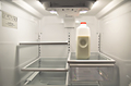
Got Food?by Jason_CrossComment: Likes: My eye goes immediately to the red cap, then to the white lights. The immediate knowledge that this is a fridge keeps my eye within the frame.
Dislikes: The bottom right corner elements are distracting, as is the fridge operating sticker in the top left. |
| Photographer found comment helpful. |
| 12/02/2006 11:28:07 PM |
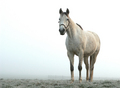
Mistyby RefocusedComment: Likes: The control over DOF, the attention the horse is giving to the frame, and the distant elements of the fence as contrasted to the coloring of the horse and the grass. All the elements carry a similar coloration, which binds the image well.
Dislikes: May not have been anything you could have done about it, but my eye is drawn to the edge of the fence line pretty quickly, taking me away from the portrait subject. Not having a bridle on the horse would have continued the isolated natural feel of the frame. |
| Photographer found comment helpful. |
| 12/02/2006 11:24:15 PM |
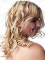
Amandaby naomikComment: Likes: lighting on the hair, sharpness of the lines around the shoulder
Disklikes: the left of the frame is lost to the overblown white while the shadow on the eyes loses the key area of focus in a portrait. |
| Photographer found comment helpful. |
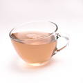
| 12/02/2006 11:22:28 PM |
A strange cup of teaby henningComment: Likes: Strong focus on the rim of the glass, color variation between the tea, the highlights, and the white. The slight shadow at the base of the cup carrying the color of the tea with it.
Dislikes: My eye goes to the bubbles first, which are out of focus. The loss of definition on the top of the handle. DOF could have been a bit better controlled. |
| Photographer found comment helpful. |
| 12/02/2006 11:18:46 PM |
Reaching Outby Sunshine86Comment: Likes: The yellow draws the eye immediately, since it's the odd color in the exposure, and that splays out via the petals to the rest of the frame. Nice DOF use to limit focus across the exposure.
Dislikes: the curli-cues/ribbons in the bottom half are vague enough that they don't draw my eye immediately following the flower, which leads me to exit the top of the frame instead of follow to the next textural sensation. If these were a little more harshly lit to draw a stronger shadow (like the one under the petals, middle right) they would provide stronger lines to pull the viewer into the bottom half of the frame. |
| 10/27/2006 12:39:00 AM |
|
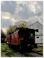
| 10/27/2006 12:38:23 AM |
don't touch my cabooseby skewsmeComment: I enjoy the color saturation and framing, but the lost detail because of the shadow at the end of the train loses too much for me. |
| Photographer found comment helpful. |
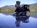
| 10/27/2006 12:30:45 AM |
Rio Grandeby jfwolpertComment: great colors, but the DOF loss in the foreground needs to be managed, as does the strong reflection off the right hand side of the train. |
| Photographer found comment helpful. |
Home -
Challenges -
Community -
League -
Photos -
Cameras -
Lenses -
Learn -
Help -
Terms of Use -
Privacy -
Top ^
DPChallenge, and website content and design, Copyright © 2001-2026 Challenging Technologies, LLC.
All digital photo copyrights belong to the photographers and may not be used without permission.
Current Server Time: 07/01/2026 01:39:37 PM EDT.