| Image |
Comment |
| 07/27/2006 03:02:35 PM |
In Blueby chakkobboComment: I love the composition here, and those are very pretty flowers. They appear to be white, yet they take on that lovely light blue hue here somehow. The only thing I would suggest would be to really crank up the contrast. The whole image is rather gray and flat. Still gets a 7 from me. |
| 07/27/2006 02:58:36 PM |
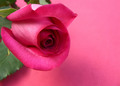
Rosieby saiphfireComment: Very nice pinks. I like the subtle texture in the background and the rose itself. I think I would prefer a shallower DOF to really blur up those leaves and maybe even the half of the rose. |
 Photographer found comment helpful. Photographer found comment helpful. |
| 07/27/2006 02:56:50 PM |
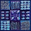
Shades of Blueby sherpetComment: This is a very cool idea, and I like the way it turned out, but there is something about it that looks off to me. Either it's a bit OOF or too heavily processed for my taste. |
| Photographer found comment helpful. |
| 07/27/2006 02:55:04 PM |
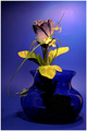
Holy Bloodby pepitoidComment: Nice reds. The liquid in the glass almost looks like smoke. This is almost abstract, and it is begging to go all the way there. Maybe shot from a different angle to include less of the base of the glass? That's just me, though. I'm a sucker for abstract. |
| Photographer found comment helpful. |
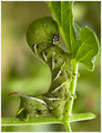
| 07/27/2006 02:53:05 PM |
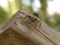
Hi There!!by johndeeregyComment: That is one knarly looking spider! His legs match the wood perfectly. I'm generally not a fan of the subject being so centered, but it works really well in this case (must be the angle and position of the wood). Very nice. |
| Photographer found comment helpful. |
| 07/27/2006 02:51:34 PM |
A gift for the Bluesby smilebig4me1xComment: The blue hues are nice, but the subject really seems to be the flower, and the blues seem to overwhelm the purples to me. There also appear to be some strange things happening with the color in the background. |
| Photographer found comment helpful. |
| 07/27/2006 02:47:51 PM |
Spider and Sunflower Matching Colorsby PlanetMakerComment: This is pretty cool. The spider and the center of the flower do indeed match well. In their current positions this is more of a "color beside color" than "color on color", but it still works for me. The main thing that would improve this for me would be a tighter crop on the spider/center to get a little more of the detail on the spider. |
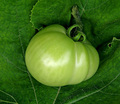
| 07/27/2006 02:44:35 PM |
Nestledby jmritzComment: Nice colors. I think I would like it better if the tomato was less centered. The light on the tomato also seems a bit flat. The leaves look really cool though! |
| Photographer found comment helpful. |
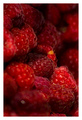
| 07/27/2006 02:43:34 PM |
Just Raspberries!by NaldComment: They look good enough to eat! I like the shallow DOF and the deep red hues. For this particular challenge, I would have liked to see a more prominent seperation between subject and backgroud, but that's just nitpicking. I like it! |
| Photographer found comment helpful. |
| 07/27/2006 02:42:12 PM |
|
| Photographer found comment helpful. |
Home -
Challenges -
Community -
League -
Photos -
Cameras -
Lenses -
Learn -
Help -
Terms of Use -
Privacy -
Top ^
DPChallenge, and website content and design, Copyright © 2001-2025 Challenging Technologies, LLC.
All digital photo copyrights belong to the photographers and may not be used without permission.
Current Server Time: 07/31/2025 09:02:18 PM EDT.