| Image |
Comment |
| 03/06/2008 02:19:52 AM |
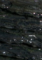
Tilted Bowlby stupidcatComment: I think this is a very good idea, but the bright parts are too bright and therefore lacking in detail. If the stones were more subdued the fish would stand out better. |
 Photographer found comment helpful. Photographer found comment helpful. |
| 03/05/2008 07:32:49 AM |
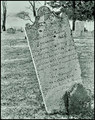
In Memory of Susanna Ebyby NikonJebComment: I like the processing you've given this, but I think you would have had a better fit for the challenge (and a higher score) if you had rotated the camera to make the gravestone vertical.
|
| Photographer found comment helpful. |
| 03/05/2008 07:29:21 AM |
|
| 03/05/2008 07:28:18 AM |
|
| 03/05/2008 03:10:00 AM |
|
| Photographer found comment helpful. |
| 03/05/2008 03:01:31 AM |
beautifulby TMsmileComment: Good idea and you've got the exposure right, but you needed to have the eyes in focus rather than the teeth. |
| 03/05/2008 02:14:05 AM |
|
| 02/28/2008 04:55:31 PM |
|
| Photographer found comment helpful. |
| 02/28/2008 04:52:19 PM |
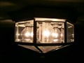
overhead lightingby nabuslComment: I'm sorry but I just don't find it very interesting. Maybe a tighter crop would have helped, so you had the light fitting filling the frame. |
| 02/28/2008 04:50:42 PM |
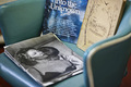
Old Black and Whiteby Phoenix-5Comment: I don't see why you have included the other two books in this. Also I think you could have done with a tighter crop to exclude the redness |
Home -
Challenges -
Community -
League -
Photos -
Cameras -
Lenses -
Learn -
Help -
Terms of Use -
Privacy -
Top ^
DPChallenge, and website content and design, Copyright © 2001-2025 Challenging Technologies, LLC.
All digital photo copyrights belong to the photographers and may not be used without permission.
Current Server Time: 07/27/2025 12:21:44 PM EDT.