| Image |
Comment |
| 06/06/2006 04:41:09 PM |
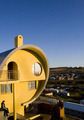
Barrel Houseby ErnirComment: Greetings from the Critique Club!
First, let me say that I am not a professional or even a very good amature photographer, so you may want to take my comments with a grain of salt.
I like this photo an awful lot. The colors are vibrant and I like the perspective. The person sitting at the bottom left gives a good size perspective. It's a unique shot and definitely a unique piece of archetecture.
However, I think the context you put the house in may have cost you a bit. Because this is an archetecture challenge, I think that the green land and houses and that the sky should have been cropped to be smaller, to put a greater impact on the building. A front-on angle may have helped too.
That being said, though, I think this photo has a great context, a great crop... I really do enjoy looking at it and I think it is a wonderful photo. It is one of those cases where it may have scored much higher in a different challenge (but of course, that is hard to predict). The things I suggest as improvements - the front angle or the cropping of sky and land - are improvements not to this photo but to this photo in this challenge, and these are two separate things.
Another note: the filesize should be as close to 150kb as possible to minimize compression artifacts. If you use Photoshop and are having problems, you can PM me - I know a lot of people have struggled with this at first.
I think you've done a great job since you have been here at DPC. In my opinion, you have a great grasp of color and composition, and despite what you said on your Burned Toast entry, lighting. In regards to the lighting, you may have to work more on controling your inside light, but with your outside shots so far I have seen good examples of using light. I hope all that makes sense. :-)
I look forward to seeing more from you!
I hope this helps! Feel free to PM me if you have any questions. |
 Photographer found comment helpful. Photographer found comment helpful. |
| 06/06/2006 01:45:03 PM |
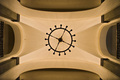
Looking Upby LERtasticComment: Greetings from the Critique Club!
First, let me say that I am not a professional or even a very good amature photographer, so you may want to take my comments with a grain of salt.
Meeting the Challenge: Great job here of course.
Composition: Perfect. You hear so much about the rule of thirds but sometimes it just makes sense to not follow it, and if done correctly, like here, I think those can be some of the most interesting photos. I may have cropped off a tiny bit of the top and bottom, to eliminate the black bump at the bottom left, but this is pretty minor.
Lighting: Seems very good. Every shape is emphasized and separate, while being a part of the complete whole.
Camera Work: You should be proud of what you did to get this great shot!!
Post Processing: Seems like you did a great job with the steps you took. I would have also cloned out the line on the middle arch on the left also, to preserve the symmetry.
Title: I like it. While your perspective is pretty self-explanatority, I would think, it is possible to be confusing to some and the title gives viewers a good reference.
Image Dimensions and Filesize: The filesize should be as close to 150kb as possible to minimize compression artifacts.
Misc / My subjective thoughts: I like seeing different approaches to things, symmetry that works, colors that blend and flow together... in short, I had a great time viewing and critiquing this photo. Thanks!
I hope this helps! Feel free to PM me if you have any questions. |
| Photographer found comment helpful. |
| 06/05/2006 05:39:14 PM |
Somnusby perotyComment: Whooo, creepy. I'm noticing noise but overall it doesn't take away from the impact of the photo. |
| Photographer found comment helpful. |
| 06/05/2006 05:36:30 PM |
|
| Photographer found comment helpful. |
| 06/03/2006 04:29:26 PM |
|
| Photographer found comment helpful. |
| 05/31/2006 12:15:56 AM |
|
| Photographer found comment helpful. |
| 05/30/2006 01:29:03 AM |
Distant Uncertaintiesby KitaComment: It seems like you captured some of her personality, which really makes a portrait interesting. Good job. |
| Photographer found comment helpful. |
| 05/30/2006 01:27:25 AM |
Black And Blue All Overby KitaComment: Oh wow. This is so stunning. I love the addition of the cat, the makeup, the asymetrical composition, the vibrant colors... everything.
edit: And I LOVE the lighting and how the lips stand out even though they are black like the rest of the face! Message edited by author 2006-05-30 01:28:07. |
| Photographer found comment helpful. |
| 05/30/2006 01:05:34 AM |
|
| Photographer found comment helpful. |
| 05/29/2006 10:02:02 PM |
Playing with Fireby lizzyc3Comment: Bah, I really love the soft focus here! I think it works very well. Gives it a sort of tribal feeling, to me. |
| Photographer found comment helpful. |
Home -
Challenges -
Community -
League -
Photos -
Cameras -
Lenses -
Learn -
Help -
Terms of Use -
Privacy -
Top ^
DPChallenge, and website content and design, Copyright © 2001-2025 Challenging Technologies, LLC.
All digital photo copyrights belong to the photographers and may not be used without permission.
Current Server Time: 08/04/2025 08:57:05 PM EDT.