| Image |
Comment |
| 08/15/2006 10:30:46 PM |
Surreal fire on iceby jsonComment: Wow, this purple shot in a sea of reds and oranges is pretty nifty. Plus I really love the "surreal" or abstract nature of it. I keep wanting to figure out if that's a hand in the bottle-shaped ice in the middle. That's a bit distracting to me visually, but is interesting to look at.
Technically the only thing I notice is the gray area to the left of the middle ice piece. Looks like you played around with colors and had to desaturate one that was not working. I wouldn't vote down for the "is that a hand" thing - even though distracting, this IS after all understood to be surreal - but I do feel I have to mark down a tiny bit for the gray. It just detracts too much, unfortunately.
But with the beautiful purple swirls and beautifully arranged ice on top of a nicely done background, the visual impact was such that this is definitely one of my favorites. So don't get me wrong about the "marking down" bit... this still got a great score from me. |
 Photographer found comment helpful. Photographer found comment helpful. |
| 08/15/2006 10:19:20 PM |
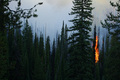
Fischer Creek Fireby die2boardComment: Eeek. I hope everything was okay.
Visually not too bad of a shot.. good colors and contrast. I love the deep, rich greens.
I think that the fire does not have enough focus however. When I look at this I see a nice photo of trees that happen to be on fire, instead of seeing "fire". Maybe a different cropping would have helped this - personally I would have been interested to see it cropped just to the left of the tree in the foreground (the one to the left of the fire area) to form a portrait-orientation, with the fire as more of a major element.
But then again, I think that so far I've seen a lot of shots of just fire. The fire in these shots is perhaps more dramatic visually but the fire does not have a context to provide any impact in my mind. This photo, however, will definitely stay with me. It makes me appreciate the *potential impact* that this fire could have on *all* that is around it, thus making the trees a hugely important part of this shot.
I thought I was going to mark you down and I am so glad that I took longer to think. Thank you for sharing this image. |
| Photographer found comment helpful. |
| 08/15/2006 10:11:59 PM |
She Hates To Be Betrayed by De SousaComment: Hm, I'm a little confused by this shot and title... but visually, it is a good image. I think it is composed well, and looks like a very artistic shot but one that manages to keep from looking too set up. |
| Photographer found comment helpful. |
| 08/15/2006 10:09:11 PM |
• Incandescent •by Bear_MusicComment: I find the border a bit off as a more orange or red tone would have complimented the photo more. But that is just a nitpick. Regarding the image, I love how you have captured the sharp detail in the coals and a soft, abstract quality to the flame. I really like that balance. |
| Photographer found comment helpful. |
| 08/15/2006 10:07:49 PM |
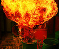
Boom!by bvoiComment: I love the way the flame made such intricate patterns. Very dramatic image. |
| Photographer found comment helpful. |
| 08/15/2006 12:29:49 AM |
|
| Photographer found comment helpful. |
| 08/14/2006 09:21:40 PM |
|
| Photographer found comment helpful. |
| 08/14/2006 08:07:12 PM |
Electric Fire Powerby RUEDISCHMUTZComment: A little bit more contrast between subject and background colors may have helped. Otherwise I think this is great - it seems alive with motion, as if the cord is being dragged along the floor. You captured "fire" in a creative and beautiful way. |
| 08/14/2006 08:05:21 PM |
Heatby gregaRComment: It's neat to see an image with blue flame instead of red/orange/yellow. I like the pattern of colors on the left corner of the metal - but unfortunately, the beauty of it distracts my eye from the flame. I think that could be just me, though; I think overall the composition is good. |
| Photographer found comment helpful. |
| 08/14/2006 08:03:24 PM |
Beginning of the Endby ImagineerComment: This is a very creative shot... um.. photo. A very creative photo. :-) I like the colors in the background as well as the cut-off composition. An all around great job in my opinion. |
| Photographer found comment helpful. |
Home -
Challenges -
Community -
League -
Photos -
Cameras -
Lenses -
Learn -
Help -
Terms of Use -
Privacy -
Top ^
DPChallenge, and website content and design, Copyright © 2001-2025 Challenging Technologies, LLC.
All digital photo copyrights belong to the photographers and may not be used without permission.
Current Server Time: 06/19/2025 06:53:41 PM EDT.